Womble - AR Learning App - UX/UI Case Study
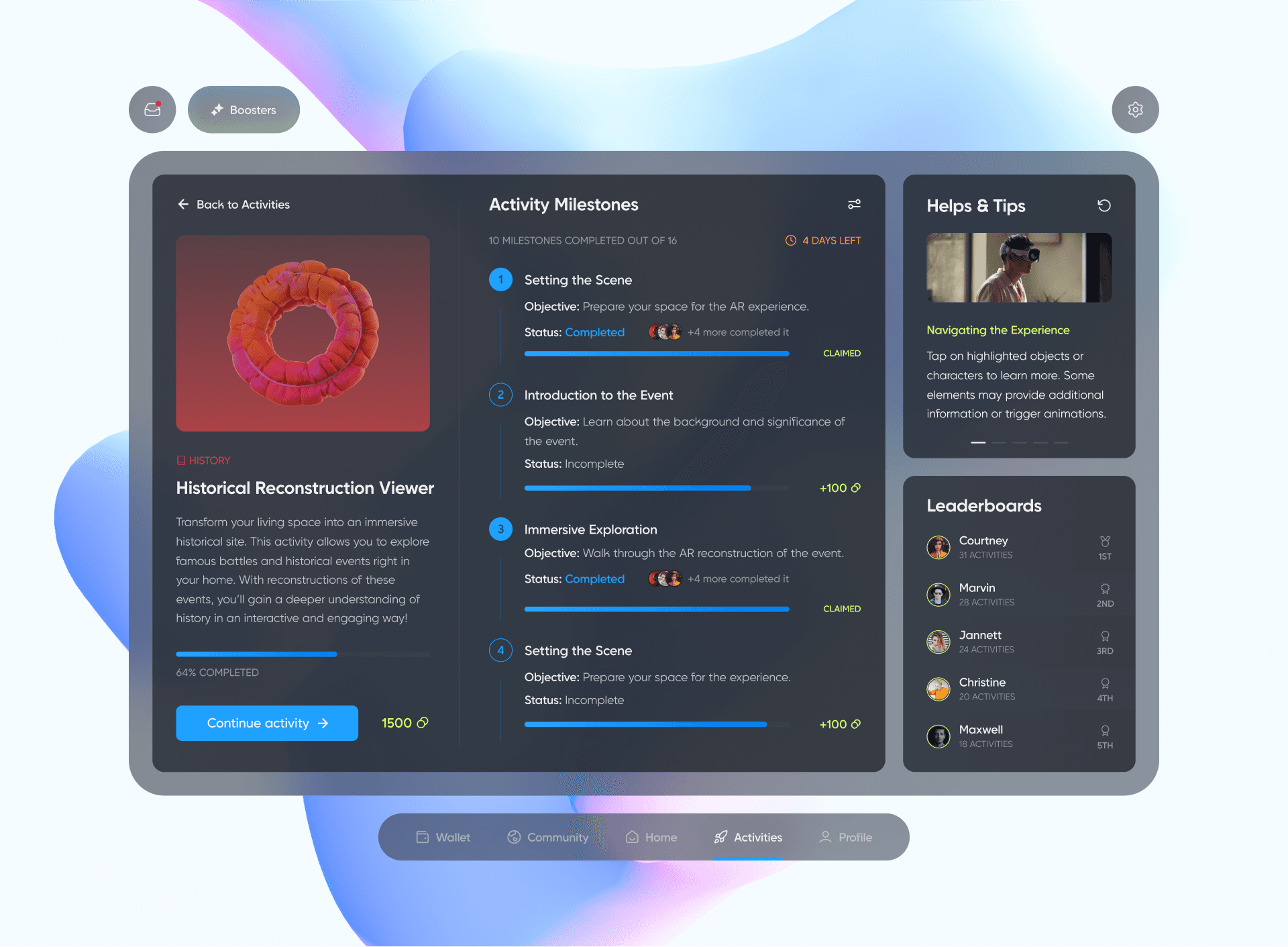
Womble is an innovative augmented reality app designed to revolutionize the way users learn and interact with historical events. By transforming everyday spaces—whether at home or outdoors—into immersive historical sites, Womble allows users to explore famous battles, significant events, and cultural milestones in a highly engaging and interactive manner.

Introduction
The project aimed to create an intuitive and immersive user experience that integrates AR technology with educational content. The design focuses on making history come alive through interactive learning experiences, helping users deepen their understanding while maintaining a high level of engagement.
Problem Statement
Traditional methods of teaching and learning, particularly in subjects like history, often fail to capture the interest and imagination of students and lifelong learners. This lack of engagement leads to disinterest and a superficial understanding of the subject. The challenge is to transform those topics from a passive subject to an active, engaging experience that resonates with learners.
AR Market Overview
The AR & VR market is projected to generate revenue of US$40.4bn in 2024.
This market is expected to grow at an annual rate of 8.97% (CAGR 2024-2029), resulting in a projected market volume of US$62.0bn by 2029.
The largest market segment within AR & VR market is AR Software, which is expected to reach a market volume of US$13.0bn in 2024.
The United States is the leading revenue generator in this market, with a projected market volume of US$10,900.0m in 2024.
In the world, the number of AR & VR market users is expected to reach 3,728.0m users by 2029.
Worldwide, the AR & VR market has seen significant growth, with countries like China and the United States leading the way in terms of innovation and adoption.
Solution
The Womble app was conceived to address these challenges by leveraging augmented reality to create a more engaging, interactive, and accessible approach to learning. By turning everyday spaces into immersive environments, Womble allows users to visualize and interact with the particular subject in ways that traditional methods cannot achieve. This concept not only makes learning more exciting and memorable but also democratizes access to high-quality historical education, providing learners everywhere with the tools to explore, understand, and connect with the eagerness learning on a deeper level.

Design Process
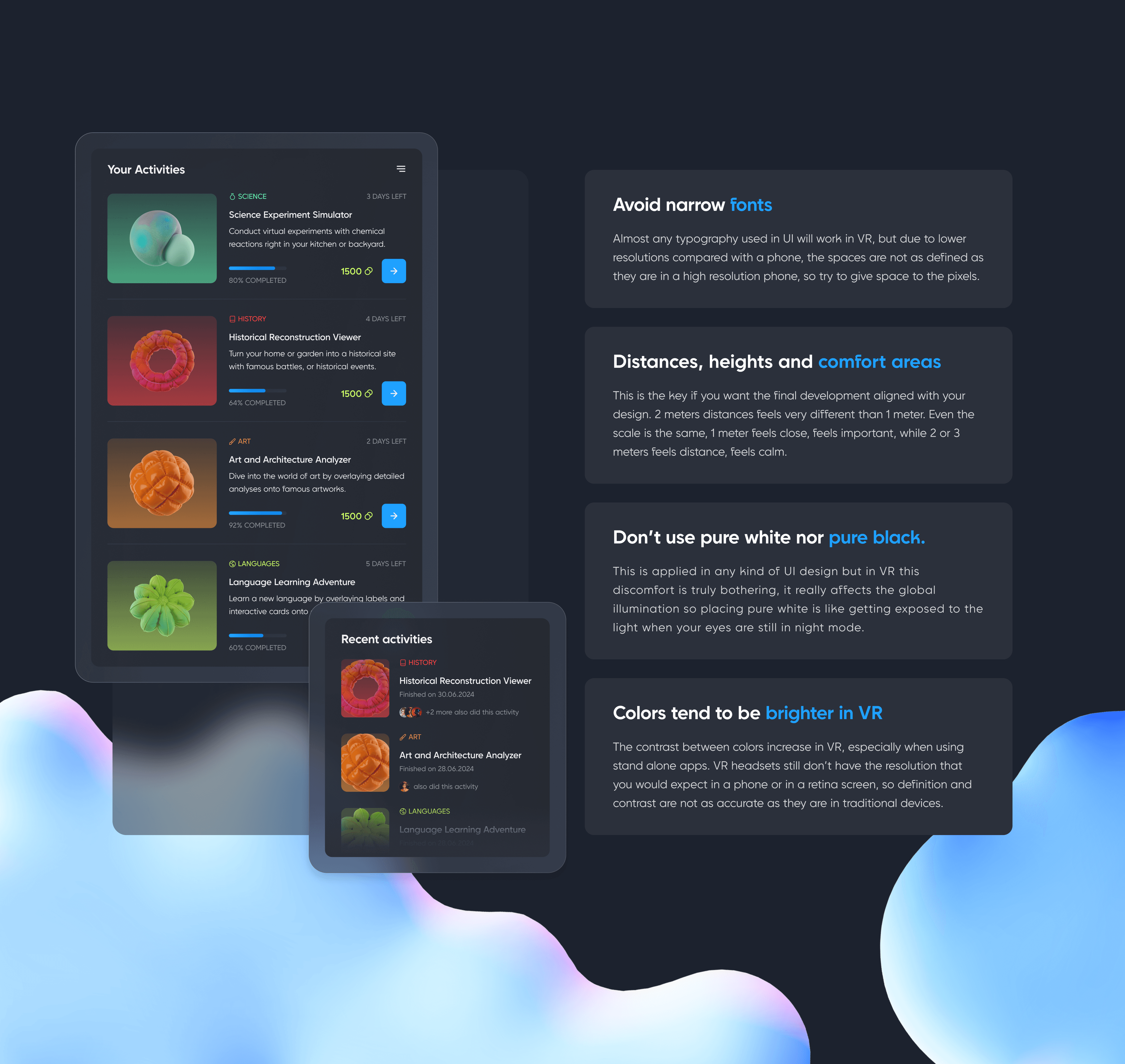
During the design process, I had to pay attention to several important constraints and requirements with respect to the design of the interface for this AR application for this project, which are listed below.
Typography
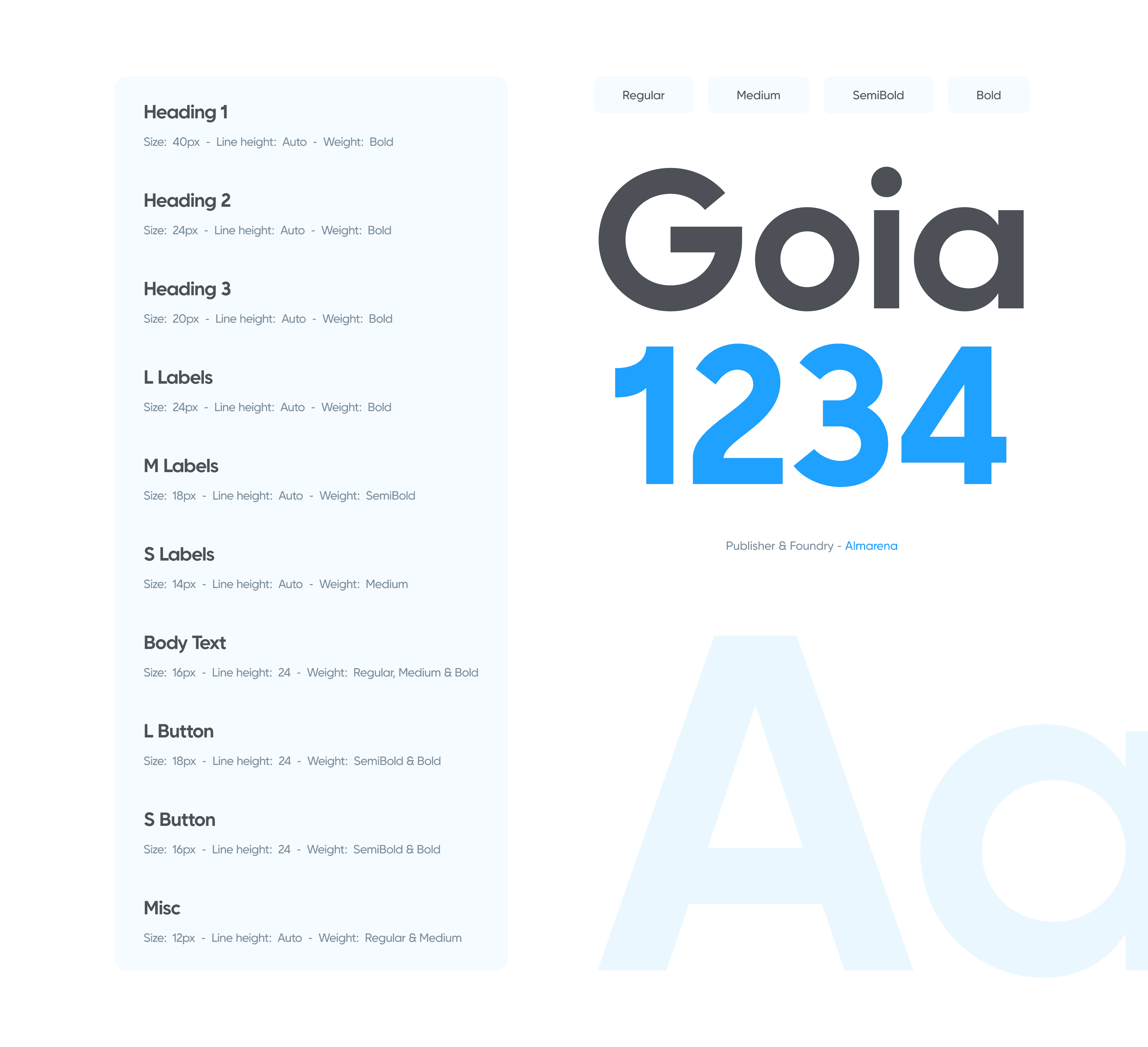
Goia is a variable sans serif typeface available in 2 styles: A first one, very readable with a touch of originality, ideal for body text and a second one "Display", more impactful with a more assertive originality. Both styles are available in a variable or static version (9 weights + italics) with many alternates divided into 3 stylistic sets.
Colors
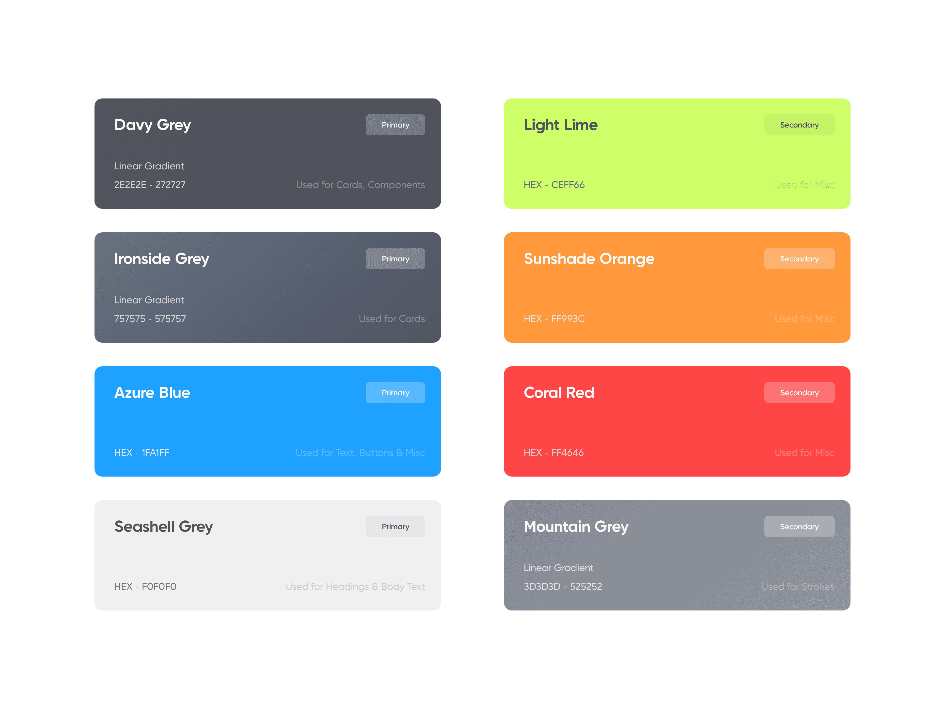
I didn’t mention the colors that appeared only once in the design, because it is not necessary to implement them into a Design System.
Icons
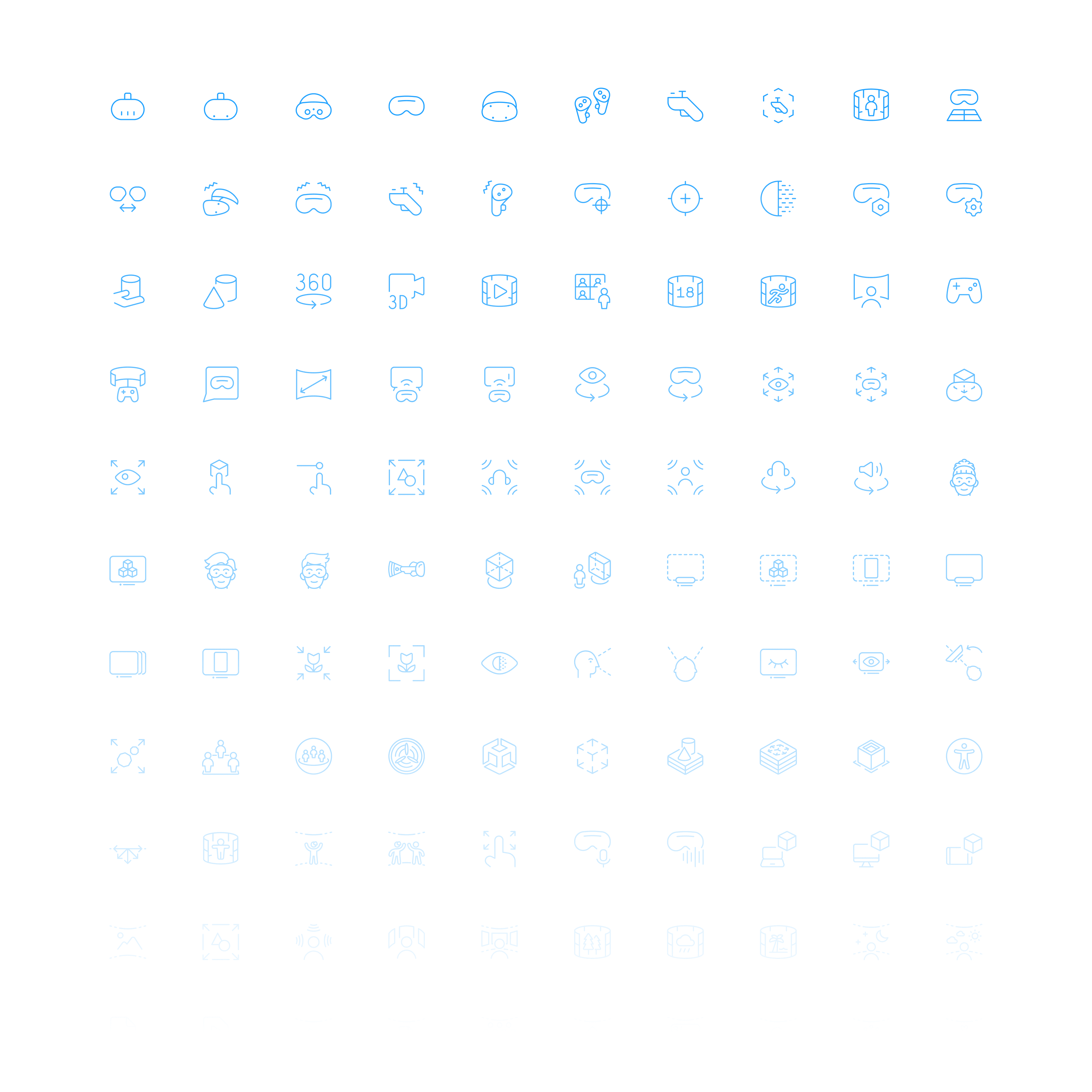
For this project, I got my icon pack from Figma Community, named 120 VR-AR Icons - Icon Set.
Visual Accessibility
I employed the 'Contrast Checker' tool provided by WebAIM to assess the contrast levels of the labels, text, and buttons within my designed application. This step was taken to ensure compliance with all WCAG standards.

Alignment & Grid
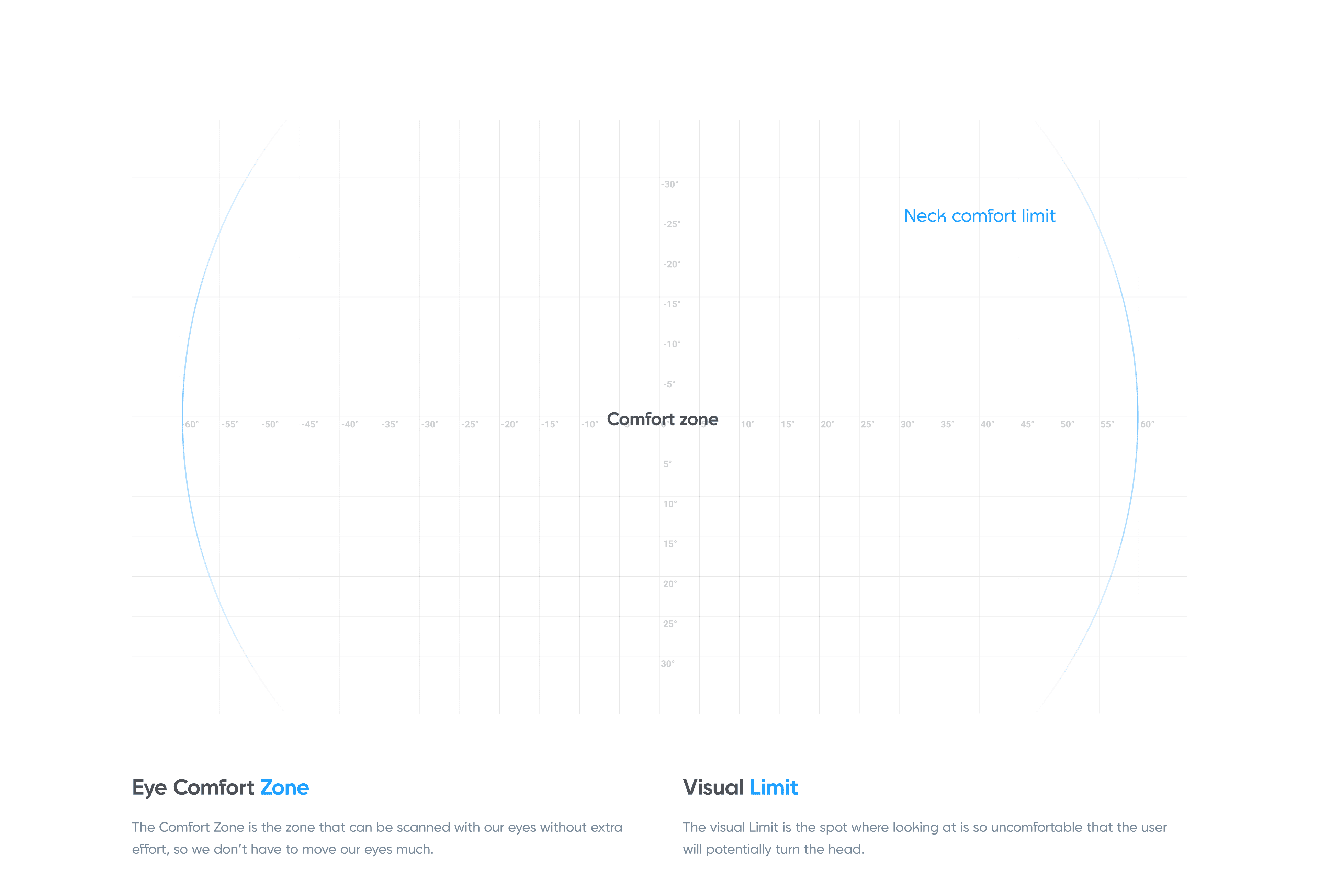
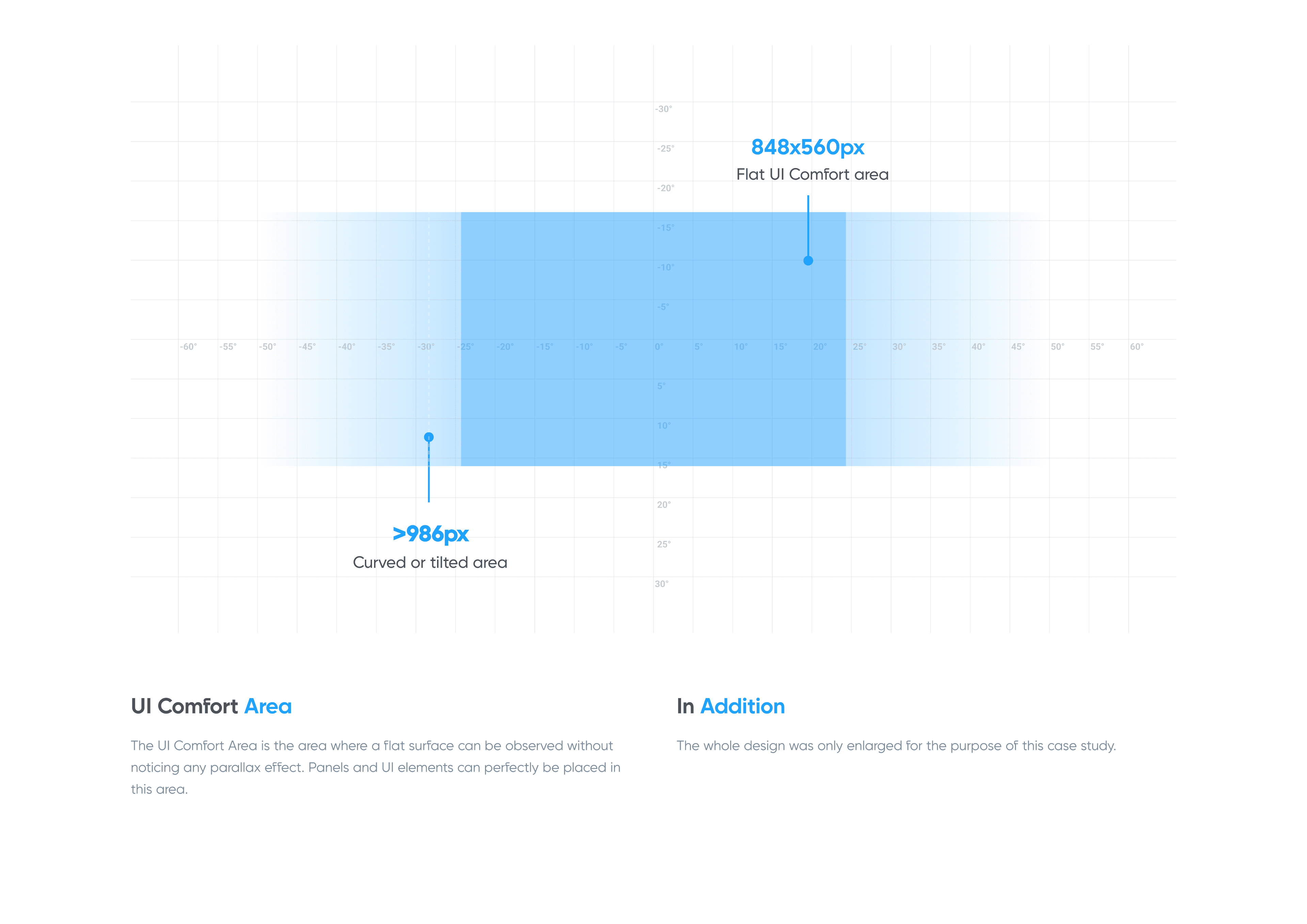
During the design process, I had to pay attention to several issues related to virtual reality devices, such as Eye Comfort Zone, UI Comfort Area, and Visual Limit. These topics are described in more detail below.
Final Design
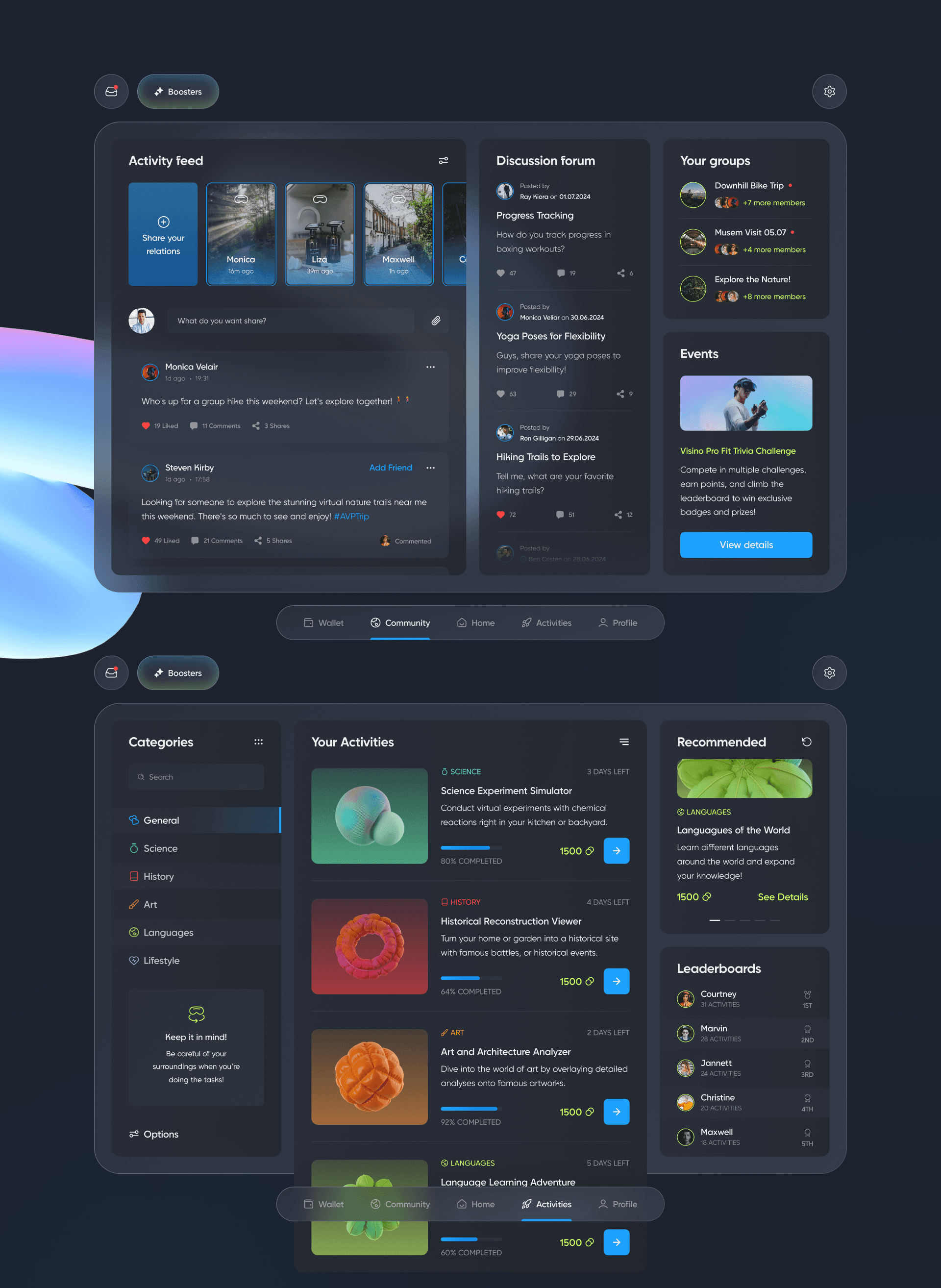
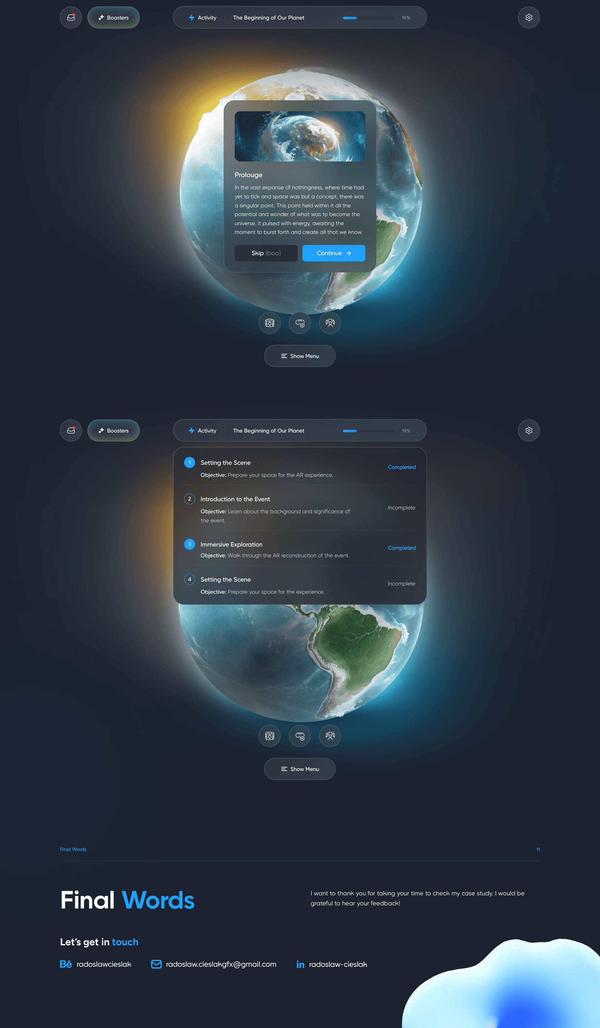
And now, we can take a look at the finished application.


Get in contact
Do you have a request or come to me with a business offer?
Write me an email and let's start working together.
radoslaw.cieslakgfx@gmail.com
Designed by Radosław Cieślak