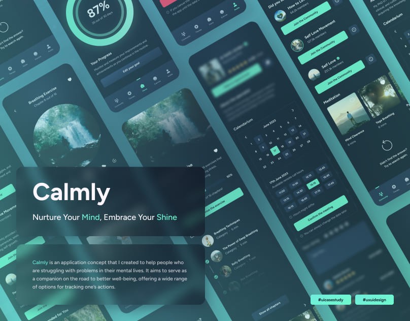
Calmly - UX/UI Case Study
Calmly is an application concept that I created to help people who are struggling with problems in their mental lives. It aims to serve as a companion on the road to better well-being, offering a wide range of options for tracking one’s actions.
Project Overview
Calmly is an application concept that I created to help people who are struggling with problems in their mental lives. It aims to serve as a companion on the road to better well-being, offering a wide range of options for tracking one’s actions. It provides full support when it comes to taking care of the user. Consultations and meetings with therapists, various excerises and meditations, as well as a wide and friendly community that brings a willingness to help are fully available at the user’s disposal.
Problem Statement
Nowadays, mental health is no longer so often overlooked, but there is still a lack of awareness about what the consequences of neglecting one’s mental state can be. Constant pressure form the environment, social networks promoting the ideal human appearance nad materialistic values, as well sa many other factors contribute to undervaluing oneself, which affects a person’s mental state. In most cases, people are afraid (or ashamed) to tell the truth to their relatives or go to a specialist with their personal problem.
Adults ages 35 to 44 experienced the highest increase in mental health diagnoses - 45% reported a mental illness in 2023 compared with 31% in 2019 - though adults ages 18 to 34 still reported the highest rate of mental illnesses at 50% in 2023.
Problem Solution
Calmly provides meditation exercises, articles about mental health, and the opportunity for free consultations with the most experienced specialists. There is also a forum where you can chime in about your problems to other users or ask for an advice completely anonymous. Calmly’s mission is to make people aware of the importance of proper mental health, as well as add encouragement nad color to other people’s lives.
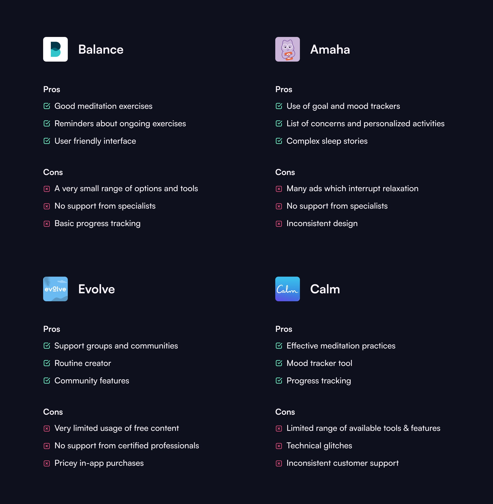
Competetive Analysis
In order to conduct a SWOT Analysis, I downloaded and installed 4 applications that compete with Calmly. I examined the basic activities in the application, as well as the application interface.
User Survey
I drew up a questionnaire with 50 respondents, who were asked to answer 10 questions in order to collect data form a group of respondents. Below are the conclusions drawn form the results of the survey.
Conclusions from the survey
More than half of those surveyed would be afraid to tell their loved ones or go to a specialist with their problems.
Most of the respondents had an episode in their lives that significantly affected (or is still affecting) their mental health.
64% of those surveyed are in favor of using a trial period on the app before they decide to switch to a paid plan.
Respondents would like an app that has activities available to help improve their mental state, the ability to get anonymous advice from a specialist or share their problems anonymously with other people, and support on their journey.
72% of respondents express a desire to be able to track their progress, as well as to set their habits as a constant reminder and encouragement to take the next steps.
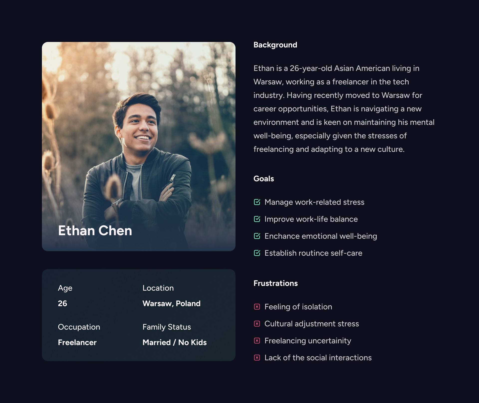
User Persona
I decided to use an User Persona to provice a detailed representation of the target audience, that would help me understand the users’ motivations, preferences, and also pain points.
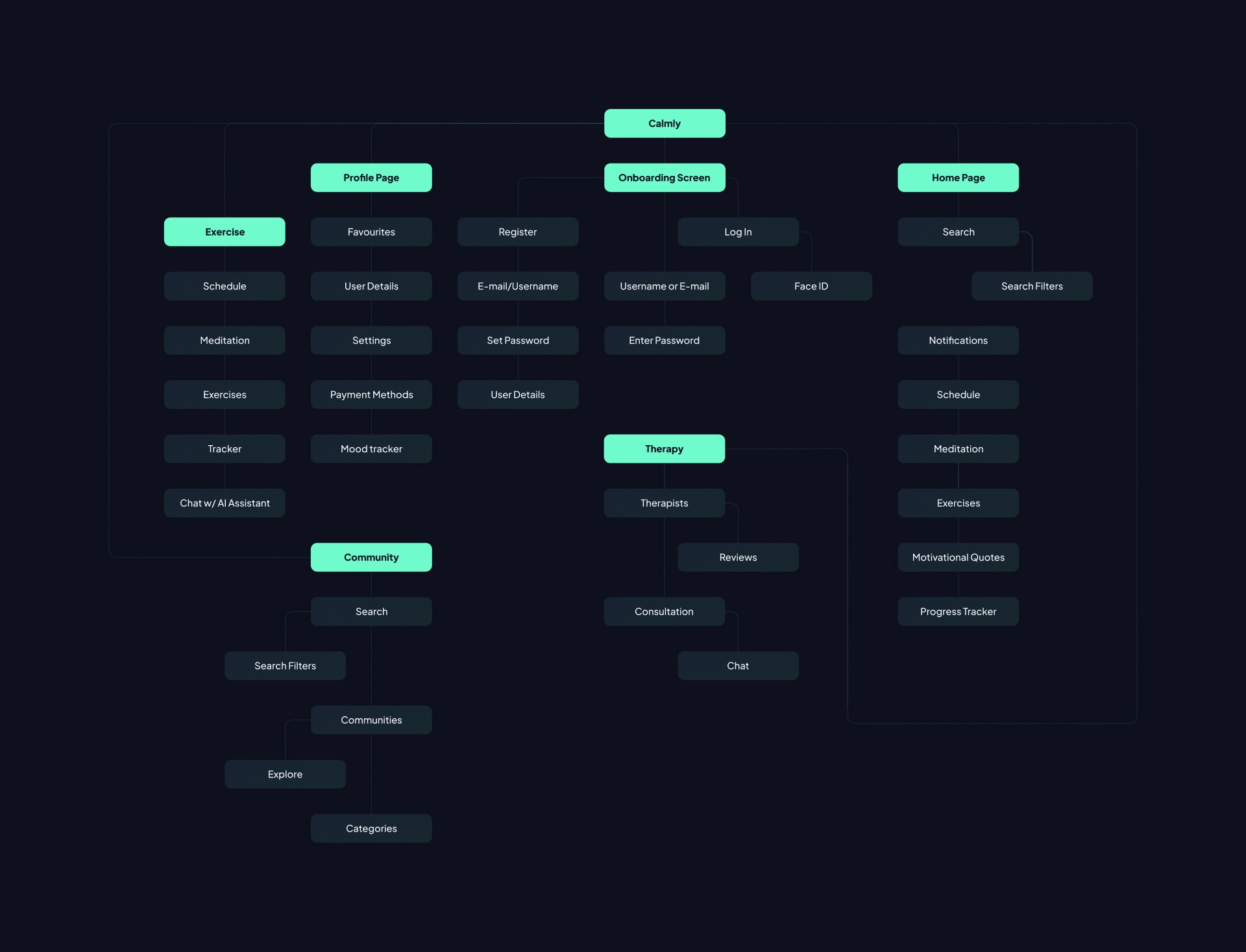
Information Architecture
The information architecture of the app was designed to ensure that users can easily navigate and find relevant content. The IA involved structuring the app’s information into logicla categories, creating a hierarchy of content,
and organizing features and functionalities.
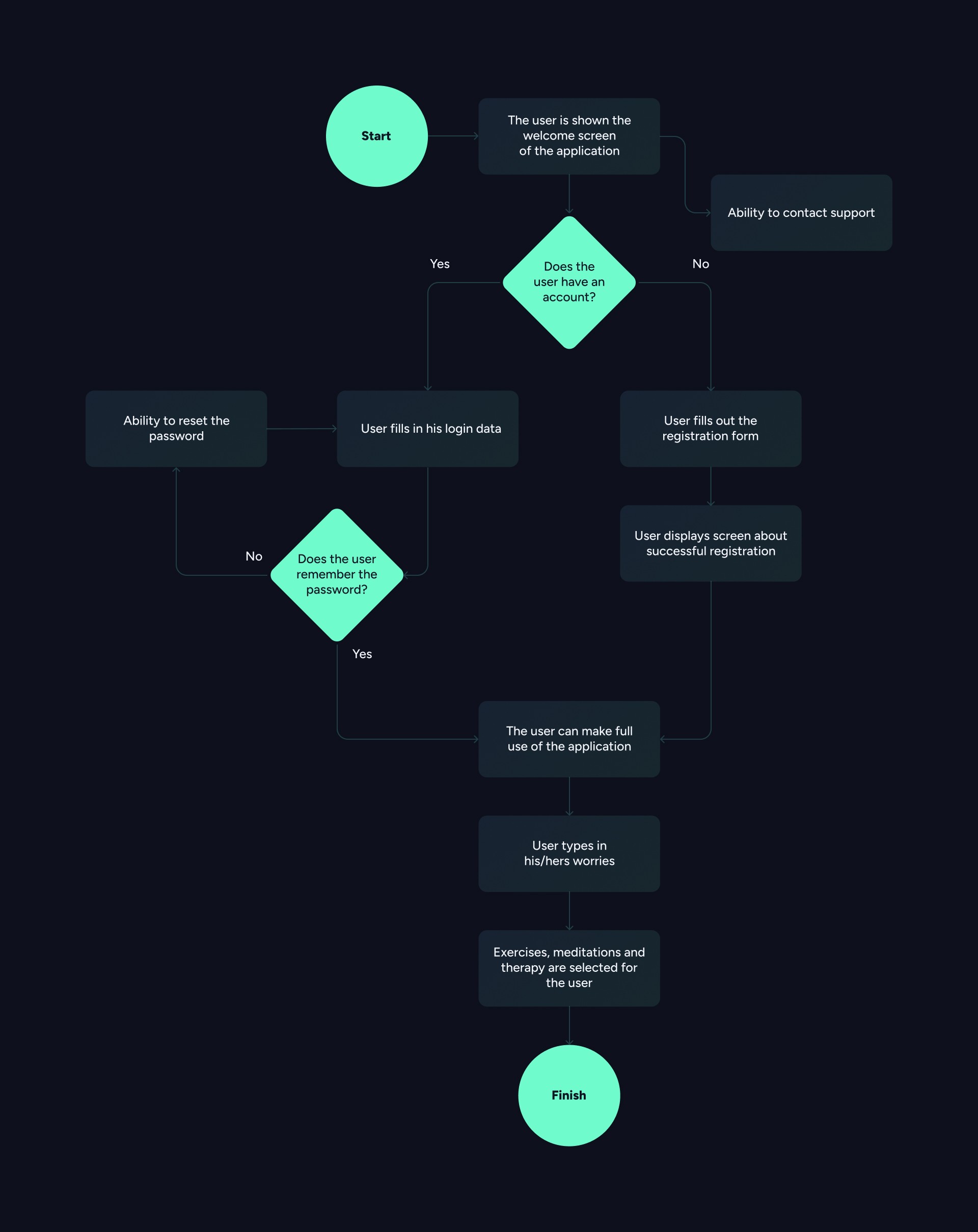
User Flow
User Flow is a graphical presentation of the paths that a user can take. The following User Flow shows the user’s journey form opening the application to using all the application’s features.
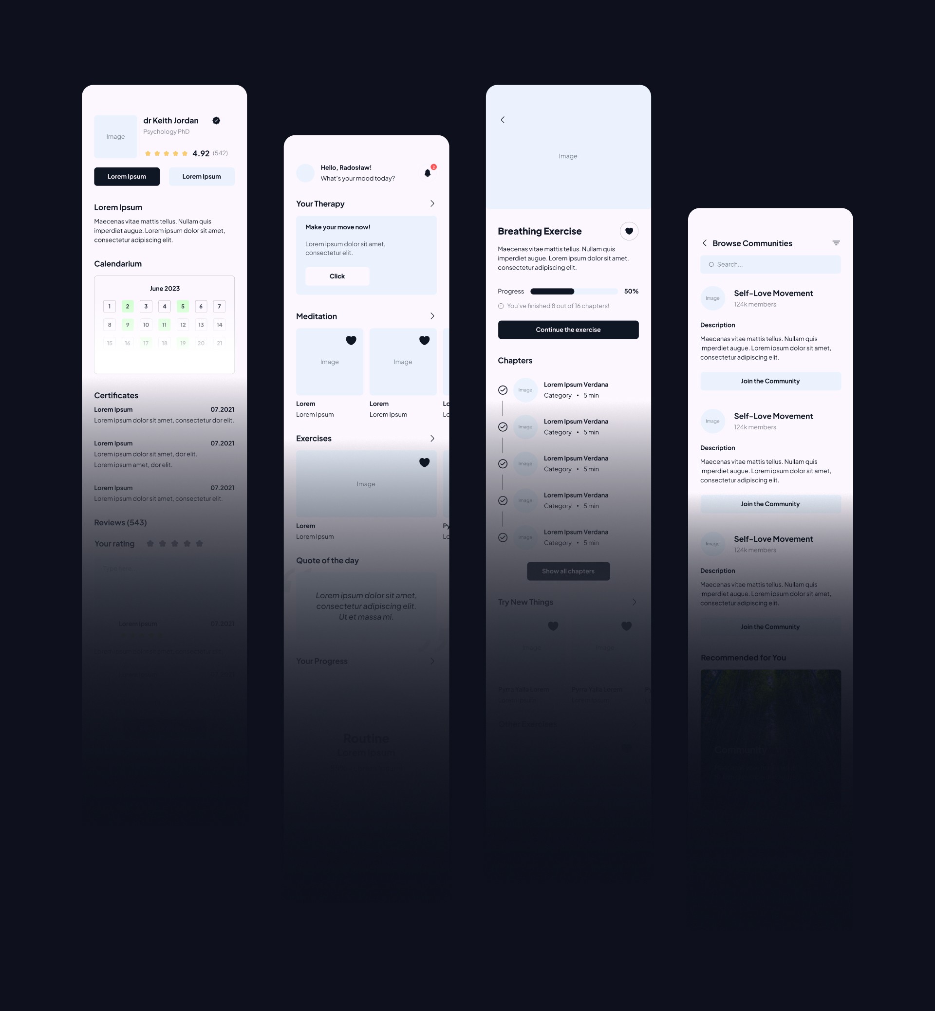
Wireframes
After I drew up the architecture information, as well as the user flow, I set about drawing up preliminary sketches. Based on these, I have created high fidelity wireframes, several of which are shown below.
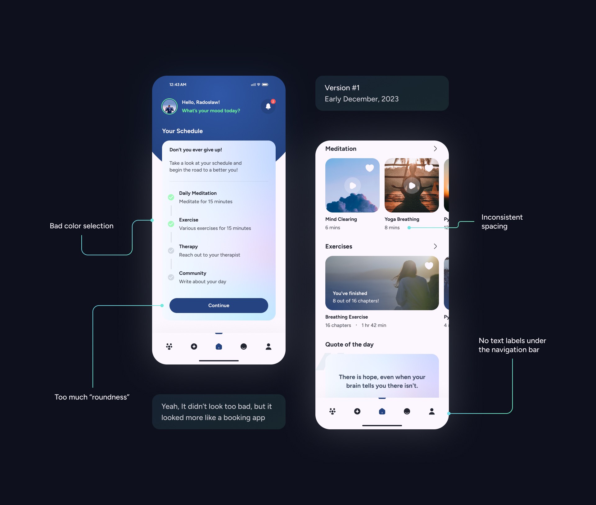
The Design Process
The whole idea, as well as the design process, was changed quite often. After designing the initial wireframes, I took on the process of designing the final version of the app. Initially, I wanted to provide the user with the feeling of a pleasant-to-use application, so I decided to experiment. However, it didn't look great. It looked quite “cheap” and didn't have much to do with a mental health app. I decided to take inspiration and approach it again with a “cool head”.
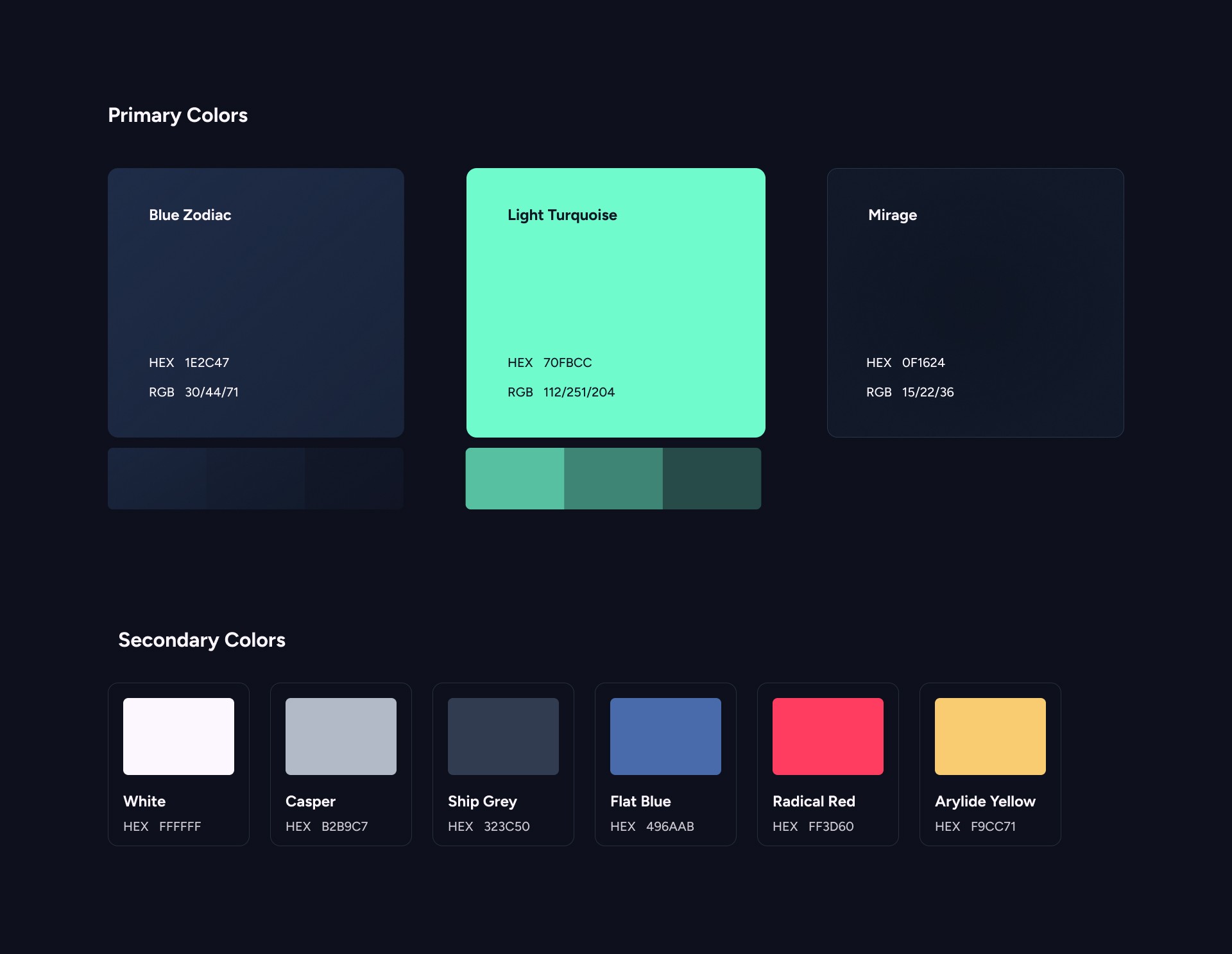
Style Guide
Style Guide, also known as a Design System, is a collection of reusable components, patterns nad guidelines that ensure consistency and cohesion in the user interface of a digital product or applicaction.
Typography
Figtree is a geometric sans serif font that combines cleanliness and approachability, making it suitable for web and mobile app usage. It includes 7 traditional weights ranging form Light to Black. I limited myself to using Regular, Medium and Bold.
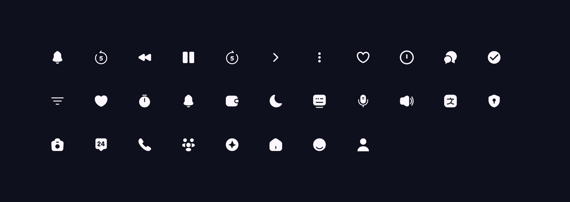
Icons
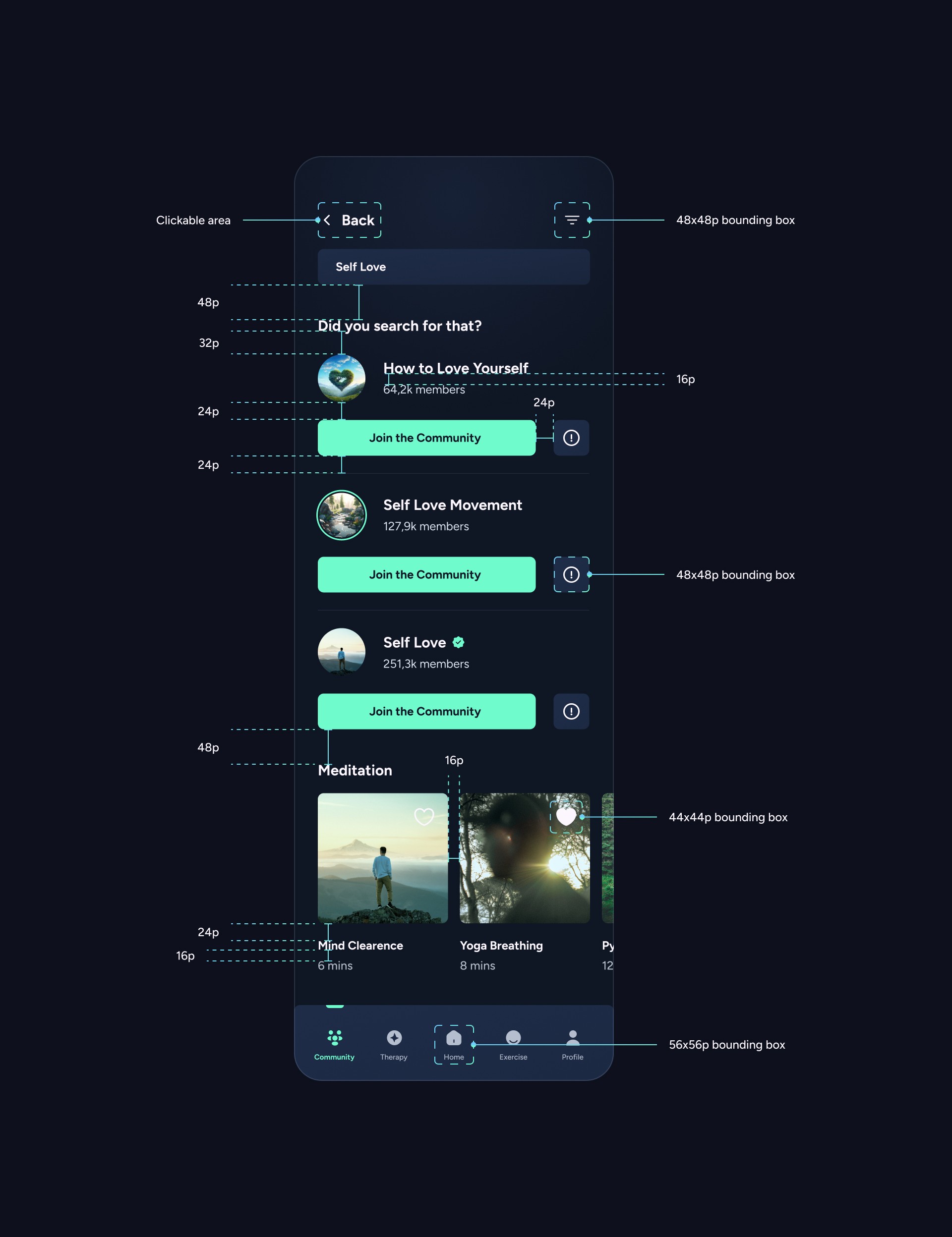
When it comes to icons, I chose the ones from the Figma plugin called Iconsax. The icons are adjusted for editing and set to a 48x48 bounding box for an easier tap.
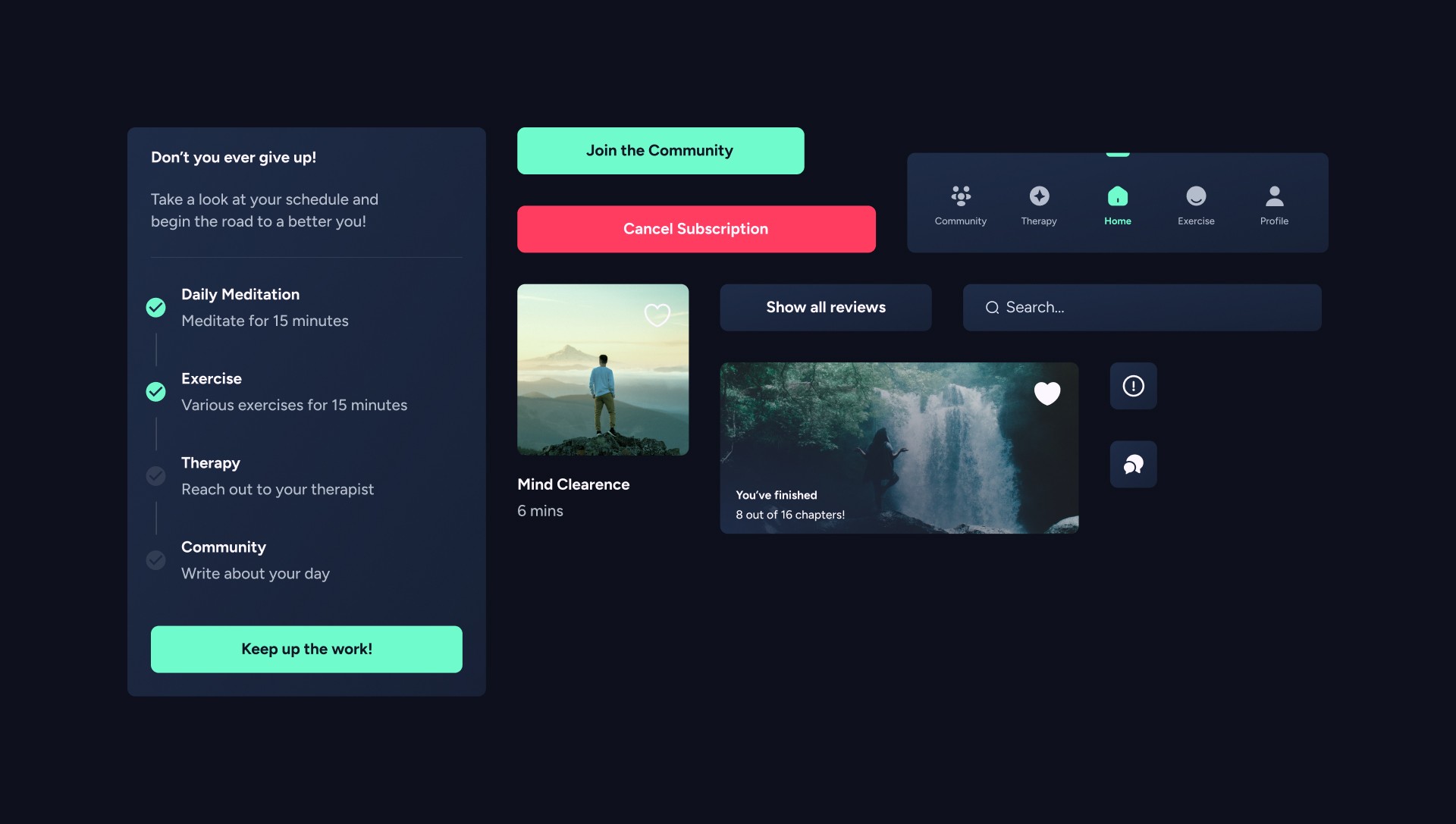
Components
I created a set of components to speed up the workflow, which consists of buttons and cards.
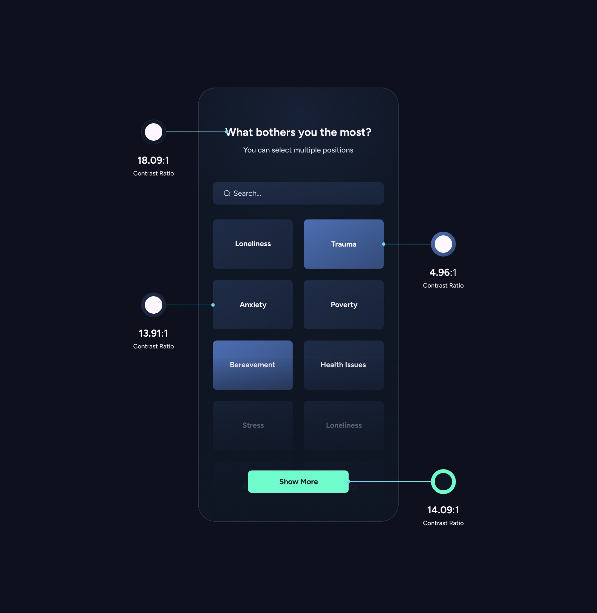
Accessibility Evaluation
To ensure compliance with WCAG guidelines, I emplyed the “Contrast Checker” tool by WebAIM to confirm the contrast levels of the labels, text, and buttons within the app I created.
Allignment & Grid
The entire design is based on a fluid grid with margins set to 32. To ensure responsiveness across various devices, Auto-Layout was implemented in the design.
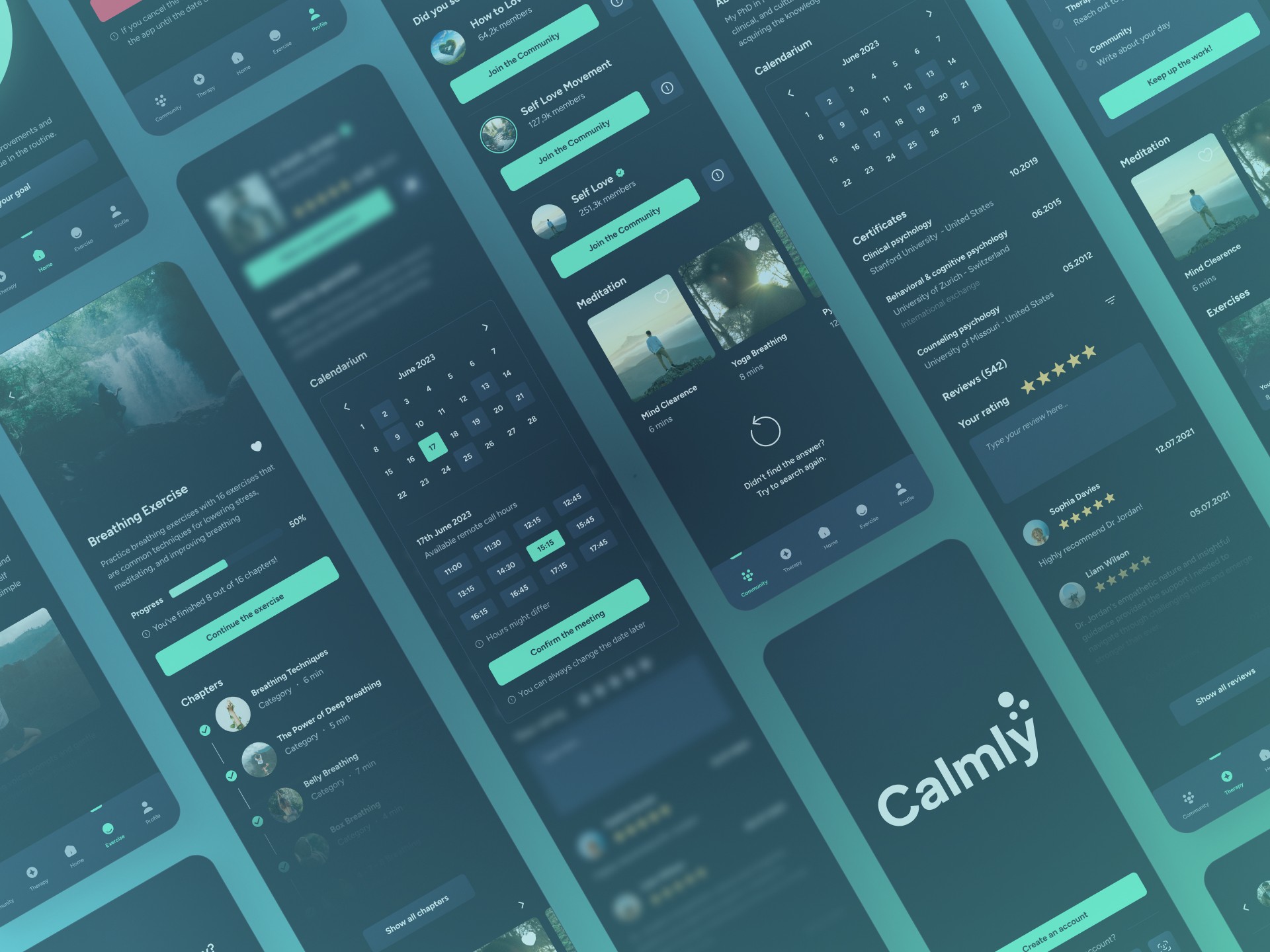
Visual Design
And now, we can take a look on the app in its full glory.

Get in contact
Do you have a request or come to me with a business offer?
Write me an email and let's start working together.
radoslaw.cieslakgfx@gmail.com
Designed by Radosław Cieślak