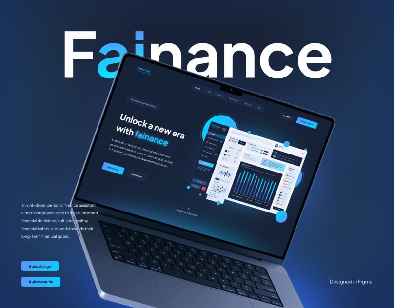
Fainance - UI Case Study
Fainance is a project that envisions a multifaceted approach, utilizing artificial intelligence to get into users' financial behaviors. The main aim of this app is to help people with managing their finances - tracking spending habits, securing their finances, and learning how to invest money wisely.
Project Overview
This project uses artificial intelligence to understand how people manage their money. It's not just about making a budget—it's about giving users helpful advice that changes as their financial situation changes.
The app even suggests investments personalized to each user, like having a financial advisor right in your pocket.
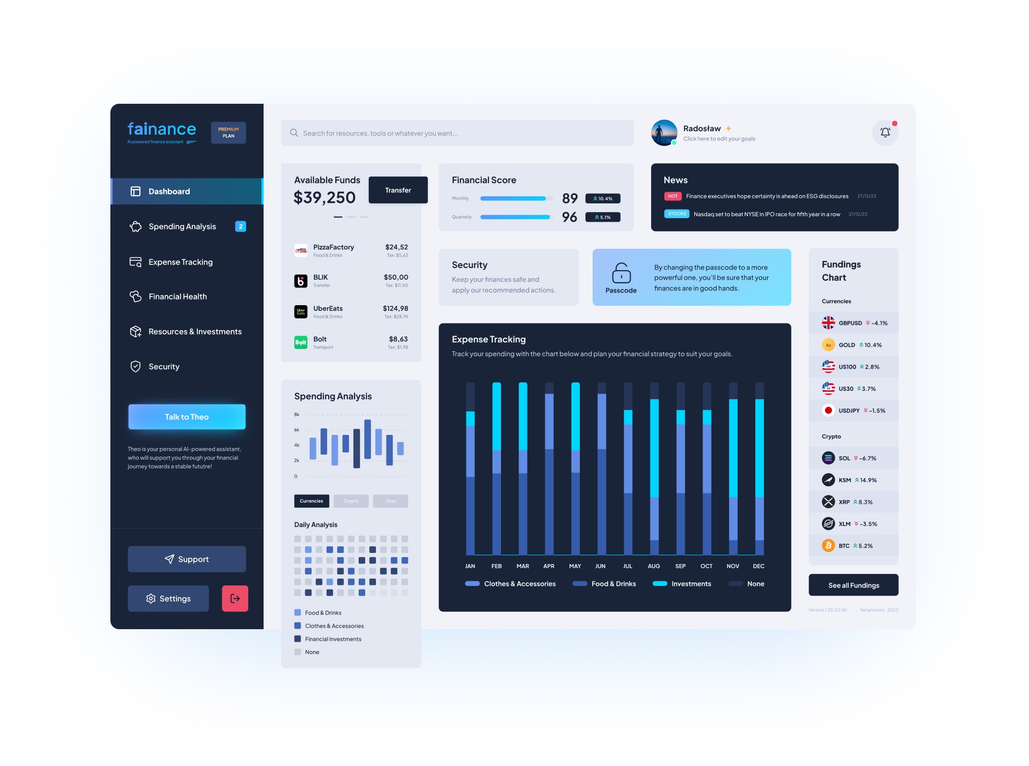
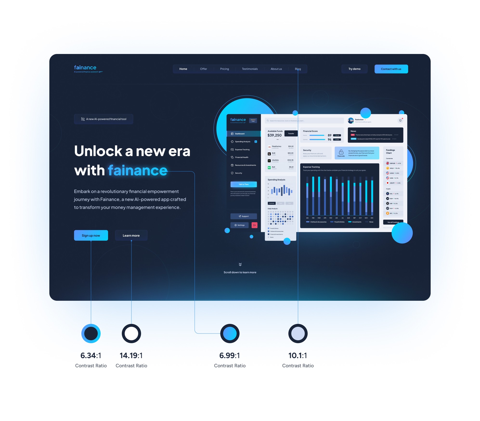
I've never designed a dashboard before, so I did some research first. Here's the final dashboard design I came up with.
User Persona
In order to understand the preferences, motivations of the users who will be the potential target audience of the website and dashboard, as well as the direction to take with my project, I decided to create a User Persona. Below is a presentation of the potential user persona.
Xavier Bennett, a dynamic 34-year-old entrepreneur, possesses a sharp financial acumen and a profound interest in optimizing his financial well-being. His overarching goal is to not merely navigate his finances but to master them, seeking a comprehensive understanding of his financial landscape for strategic management. However, even with his financial prowess, Xavier encounters specific challenges that propel his drive for financial success.

Typography
For my project, I utilized the "Plus Jakarata Sans" font as it possesses a minimalist and modern design. The Plus Jakarata Sans font comes in 7 different weights, starting from ExtraLight to ExtraBold.
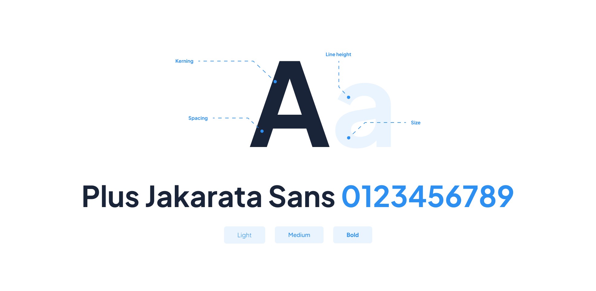
I used 3 different weights to make the design a little bit more interesting, but not oversaturated.
I wanted to ensure that all headings are clear and legible, so I decided to increase the line height to a sufficient size. By trial and error, I came to the conclusion that the best and most pleasing to the eye solution is to multiply the font size by 1.36.
I rounded some of the values off because, for example, multiplying 48 by 1.36 yielded a result of 65.28, so I assumed a value of 64 to keep it a full and even number
When it comes to smaller fonts, I wanted to keep things simple. I kept the original line height for the buttons, navigation and miscellaneous elements, because it was not necessary to change it. I have only set the line height at 36 for the body, as this is much clearer and more readable
Colors
As the website offers an application in the financial segment, I opted for the use of colours that give the user a sense of confidence, trust and security about the product.

I have prepared a colour palette, to ensure that everything is under control and to avoid any inadequacies
I decided to limit myself to a maximum of 5 colours, in order not to introduce chaos into the design, and also to limit cognitive load
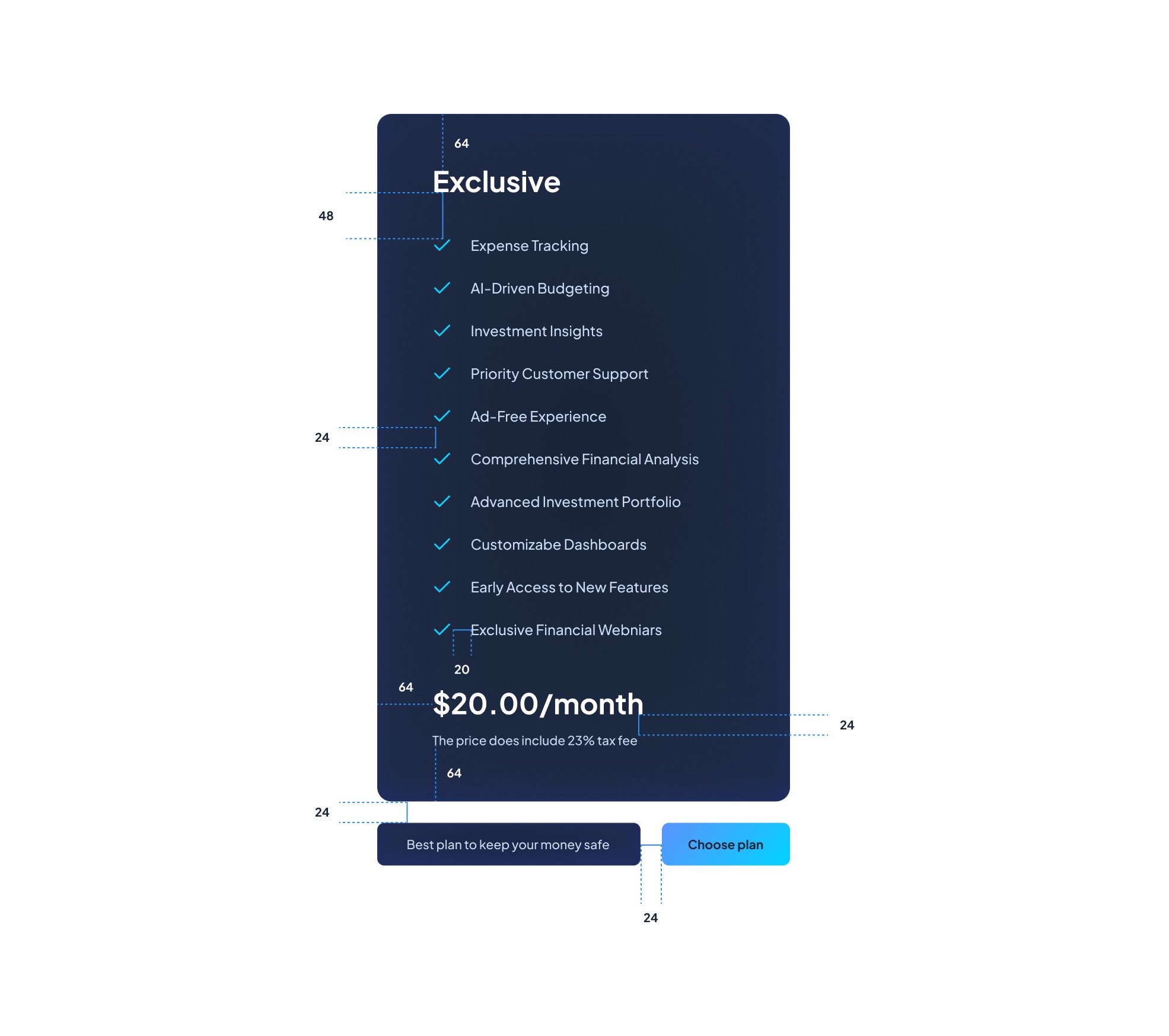
Alignment & Grid
For my project I used an 8 point grid system. The margins were set to 112, the gutter was set to 32, and the width was set to 96. I also utilized Auto Layout during the design to guarantee that everything is resposnive on different devices and screen sizes such as mobiles phones.
Accessibility Evaluation
I used the 'Contrast Checker' tool from WebAIM to verify the contrast of the labels, text, and buttons in the website I designed, in order to ensure that it meets all WCAG requirements.
Full Site View
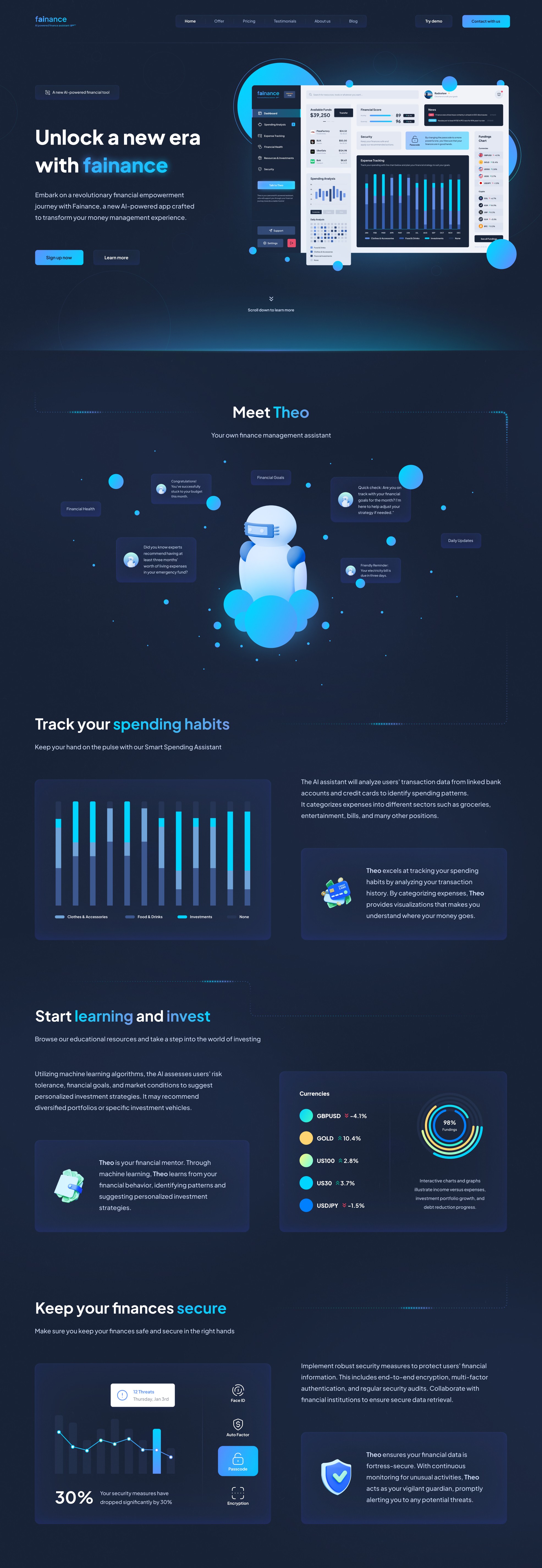
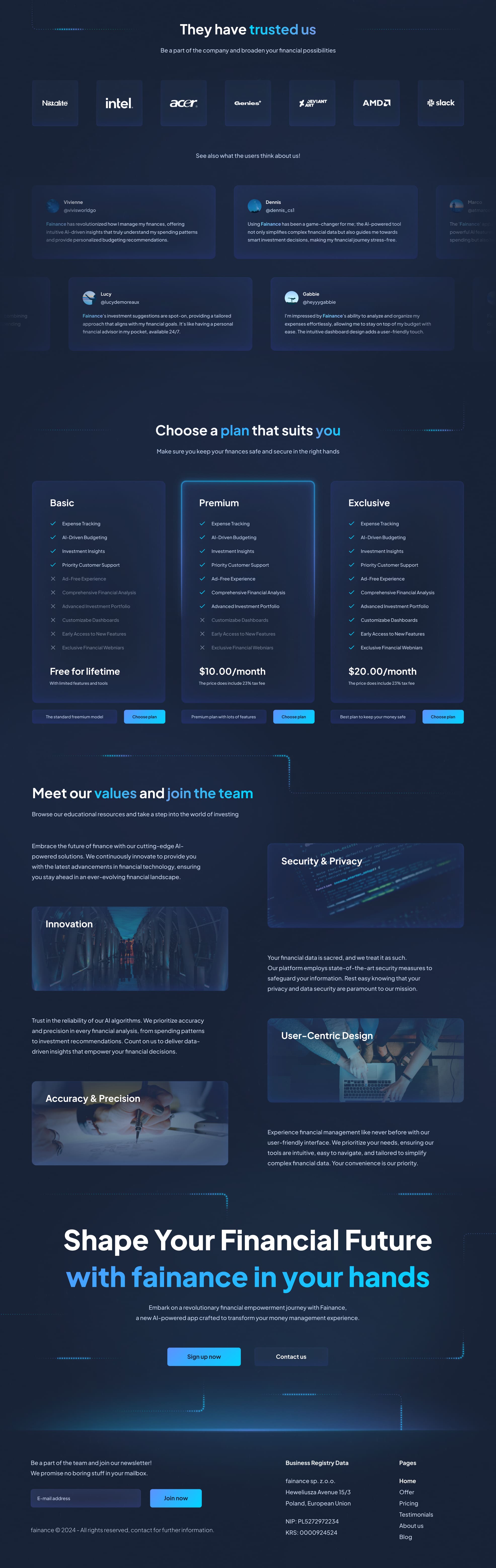
And now, we can take a look at the finished website.
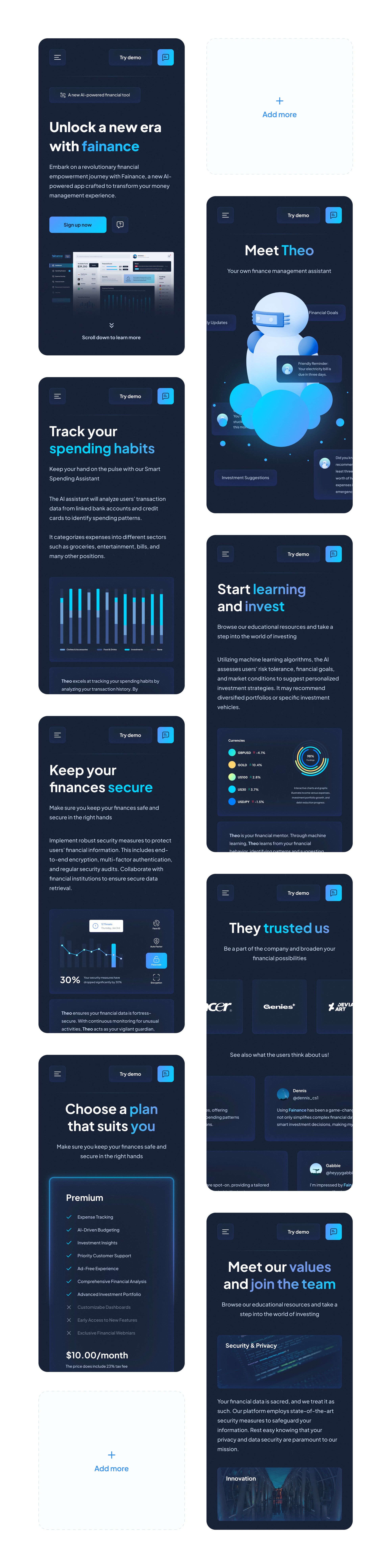
Mobile View
I’ve changed the font sizes for the mobile version, and also I modified the navigation bar as well as the cards and buttons.
Get in contact
Do you have a request or come to me with a business offer?
Write me an email and let's start working together.
radoslaw.cieslakgfx@gmail.com
Designed by Radosław Cieślak