FoodWell - UX/UI Case Study
FoodWell is an application concept that changes the way people think about eating and reducing food waste. It's not a regular app, it is a push for a better future where food is valued, resources are used more wisely, and care about the environment as much as we can.
Project Overview
The main aim with this project is to build a mobile app that's all about tackling food waste head-on. The purpose of this applicaction is to give people the power to make greener choices every day. By blending tech smarts with designs that put people first, Foodwell is out to make a real difference. And the projects goal? To help create a fairer, more sustainable food system that benefits everyone.
Problem Statement
Food waste isn't just a local or national problem - it's a huge global issue that's incredibly important. Every year, billions of tons of food are thrown away, which makes environmental problems worse, wastes money, and creates unfairness. The effects of food waste spread through many parts of life, affecting things like climate change and whether everyone has enough to eat. But we can build a future where food is valued.
Problem Solution
FoodWell is a game-changer in how to deal with food and cutting down waste. It's not just an app—it's a push for change, a step towards a future where we really appreciate food, make the most of what we have, and put sustainability first. It is designed to empower people to make informed decisions about their food consumption habits, ultimately minimizing waste and maximizing resource utilization.
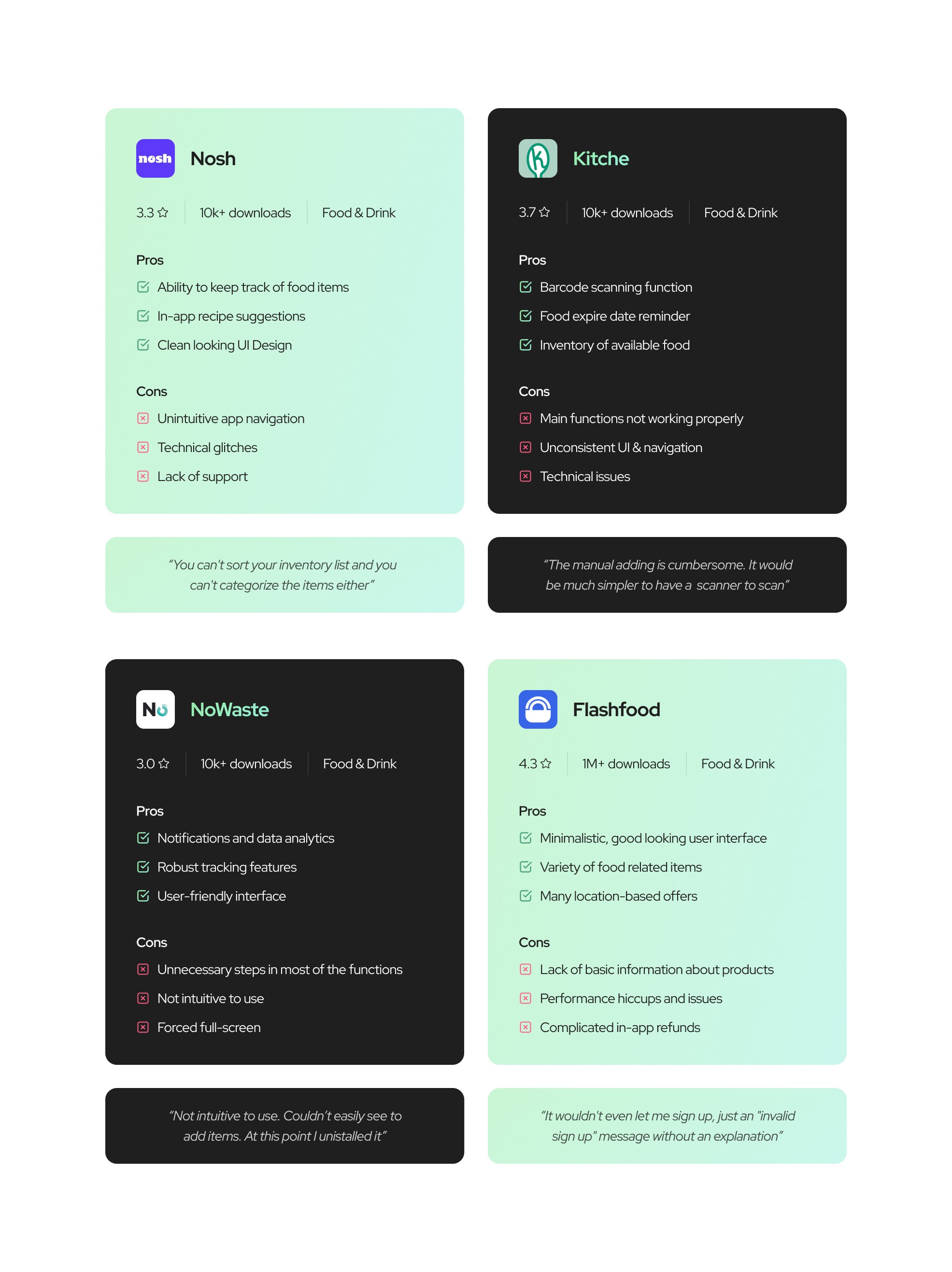
Competitive Analysis
To initiate a comprehensive SWOT Analysis, I downloaded and installed four applications that compete with FoodWell. I’ve examined each applicaction in terms of fundamental functionalities, coupled with a detailed assessment of their user interfaces.
User Survey
I formulated a questionnaire consisting of 6 questions and distributed it among a group of 50 respondents. The objective was to gather comprehensive data from diverse perspectives. Subsequently, I analyzed the survey results to draw meaningful conclusions.
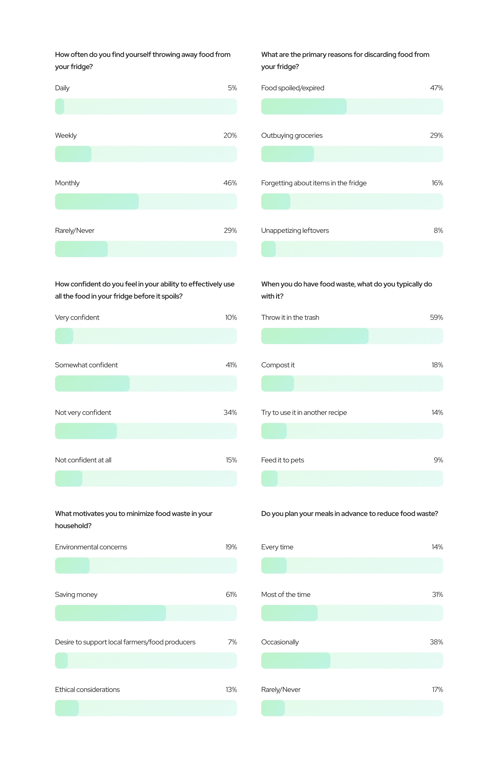
The survey indicates that a significant portion of individuals find themselves discarding food waste once a week, followed by a monthly frequency. This suggests a recurring issue of food waste management in households, emphasizing the importance of implementing strategies to reduce wastage.
A majority of respondents expressed a moderate level of confidence in their ability to utilize food items effectively before they expire. While this indicates a certain level of awareness towards reducing waste, there is room for improvement in terms of food usage and minimizing leftovers.
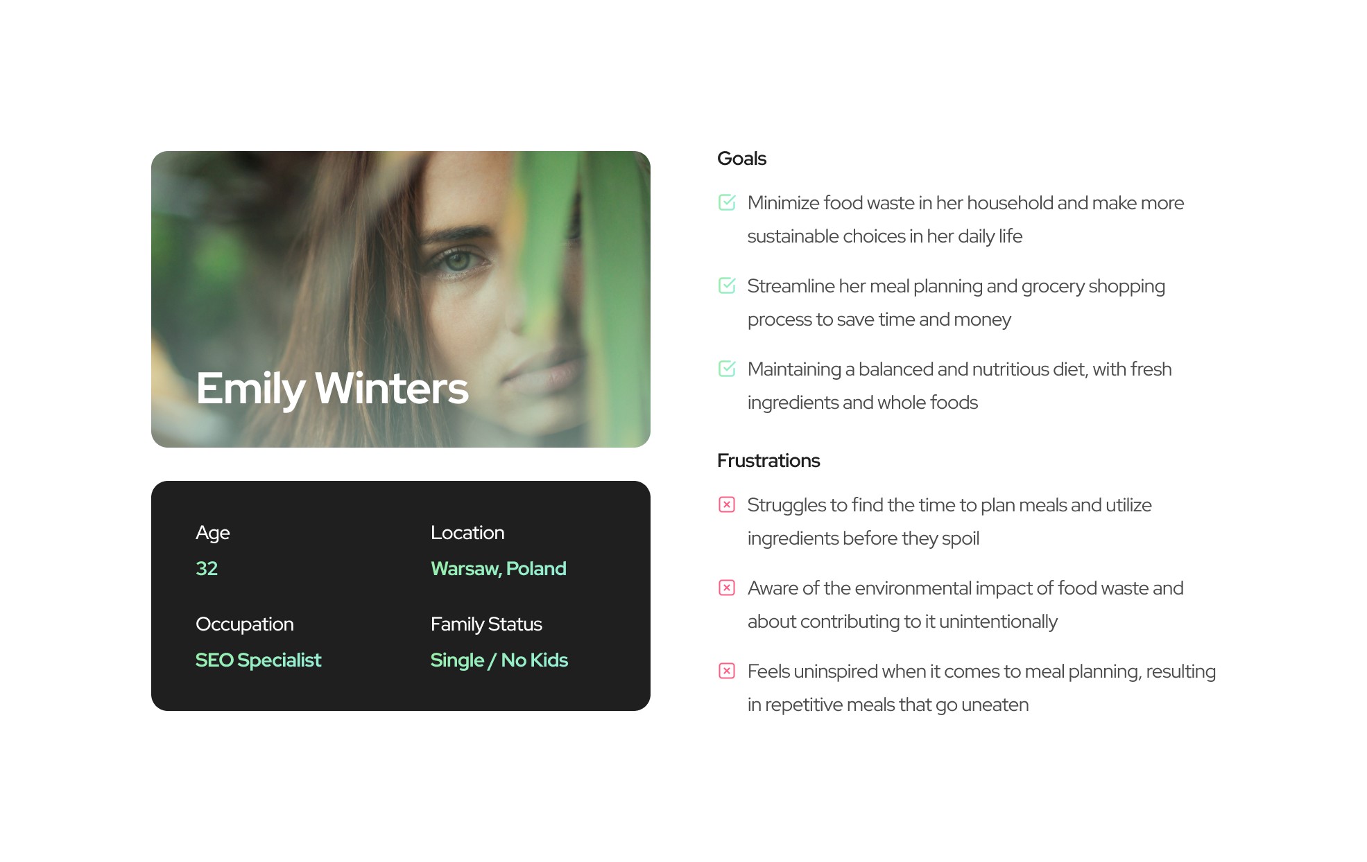
User Persona
I implemented a User Persona to get into the heads of the target audience. By crafting a detailed User Persona, I sought to create a comprehensive framework that would guide the development process and ensure alignment with the needs and desires of the intended user base.
Emily, a 32-year-old professional residing in a vibrant urban setting, maintains a hectic schedule balancing her career in marketing with personal pursuits and social engagements. Prioritizing health, she emphasizes nutritious meals and enjoys discovering recipes during her leisure moments. Despite her conscientious efforts, she often faces challenges managing leftover ingredients and unused groceries, attributable to time constraints or insufficient planning.
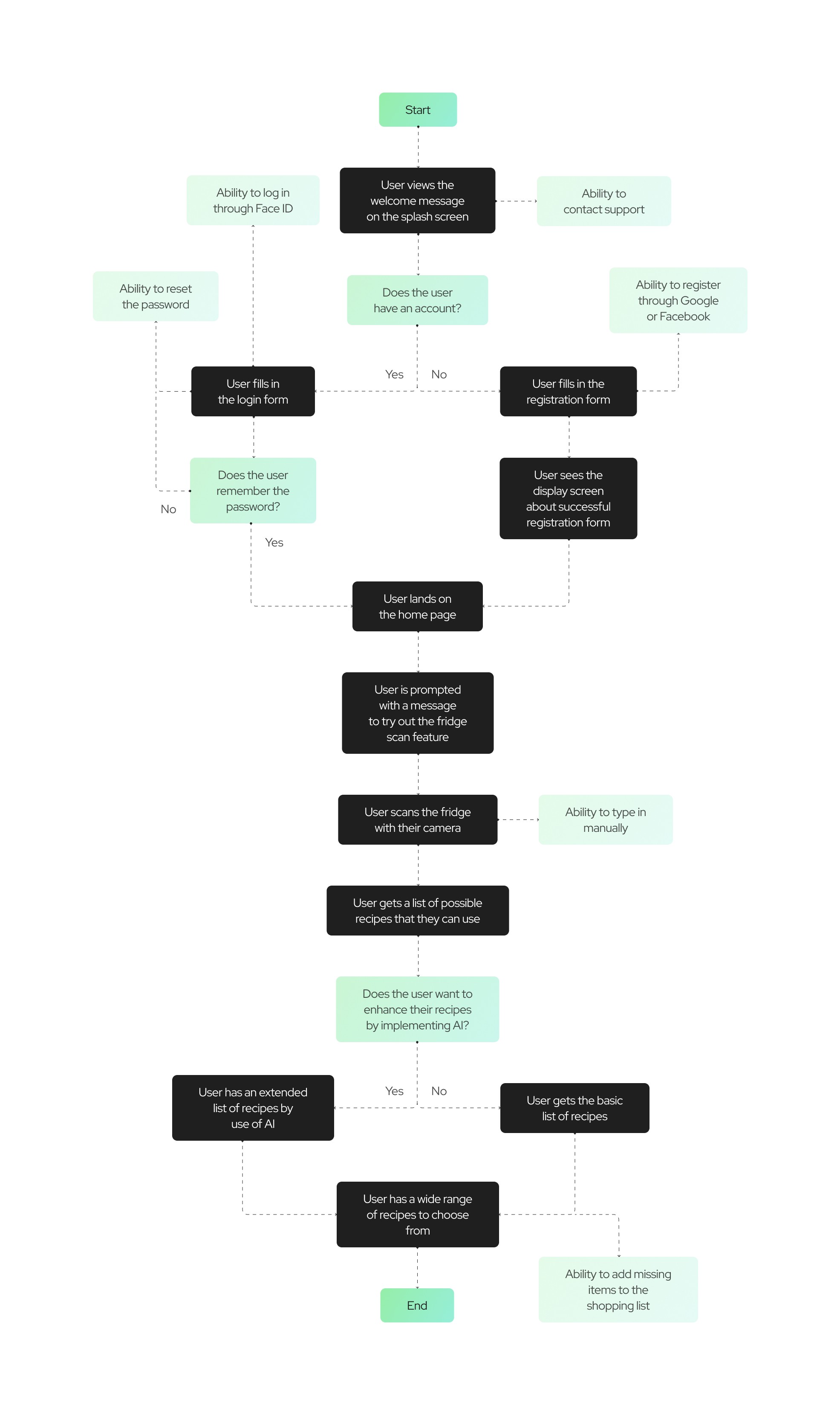
User Flow
A User Flow is a visual representation depicting the various routes a user may follow within an application. The provided User Flow illustrates the complete journey from when the user initiates the application to engaging with all its available features.
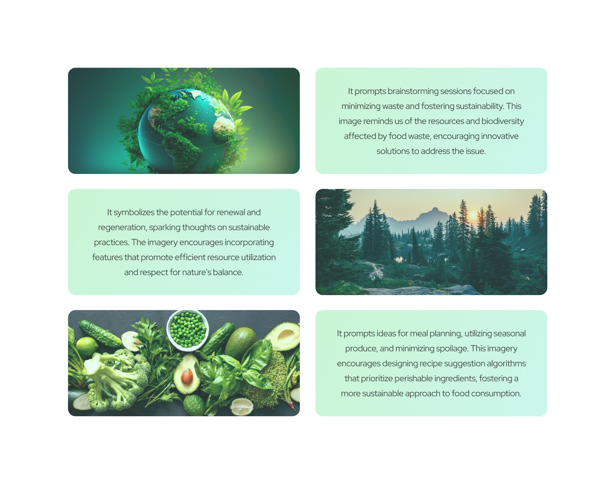
The Design Process
During the whole design process, I wanted the application to be as 'green' as possible. Not only in terms of colour, but also in terms of function and solutions. Here’s some inspiration I took.
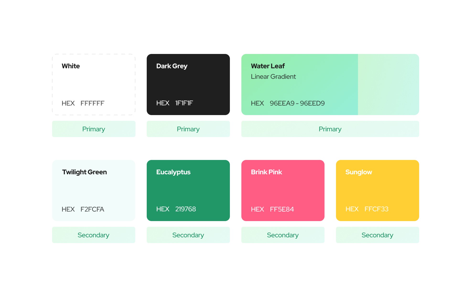
Colors
As mentioned earlier, I wanted to give it a “green” and eco-friendly touch so I opted for colors that resonate the most with a vision of a clean and healthy world.
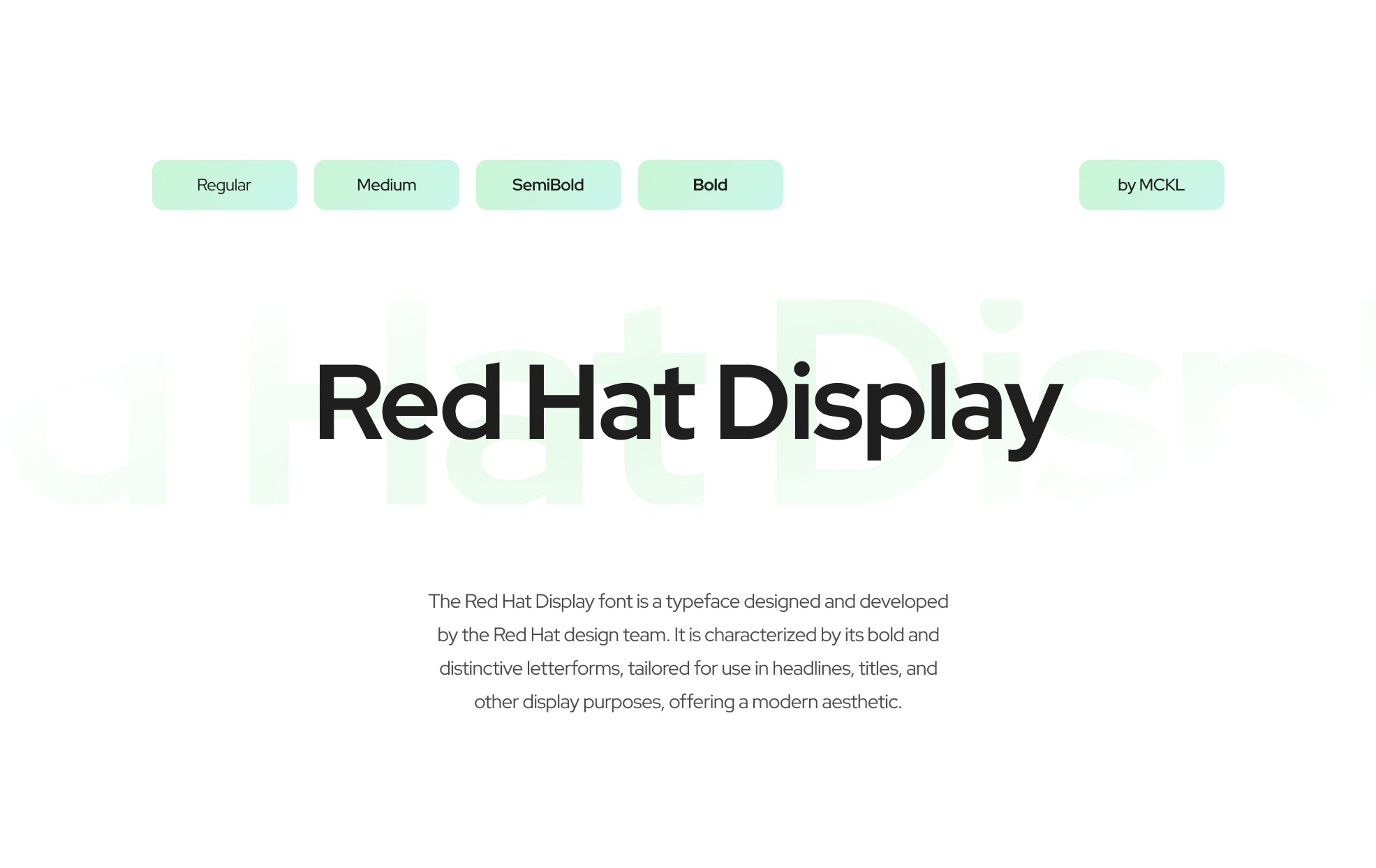
Typography
The Red Hat Display font is a typeface designed and developed by the Red Hat design team. It is characterized by its bold and distinctive letterforms, tailored for use in headlines, titles, and other display purposes, offering a modern aesthetic.
I decided to use the Red Hat Display font because of its modern and clean look. It encompasses seven traditional font weights, spanning from Light to Black. I limited myself to using only 4 weights. I used a -2% kerning on all of the sizes and weights for optimum readability, and also I multiplied the body text line height by 1.5 in order to make sure, that the text is readable.
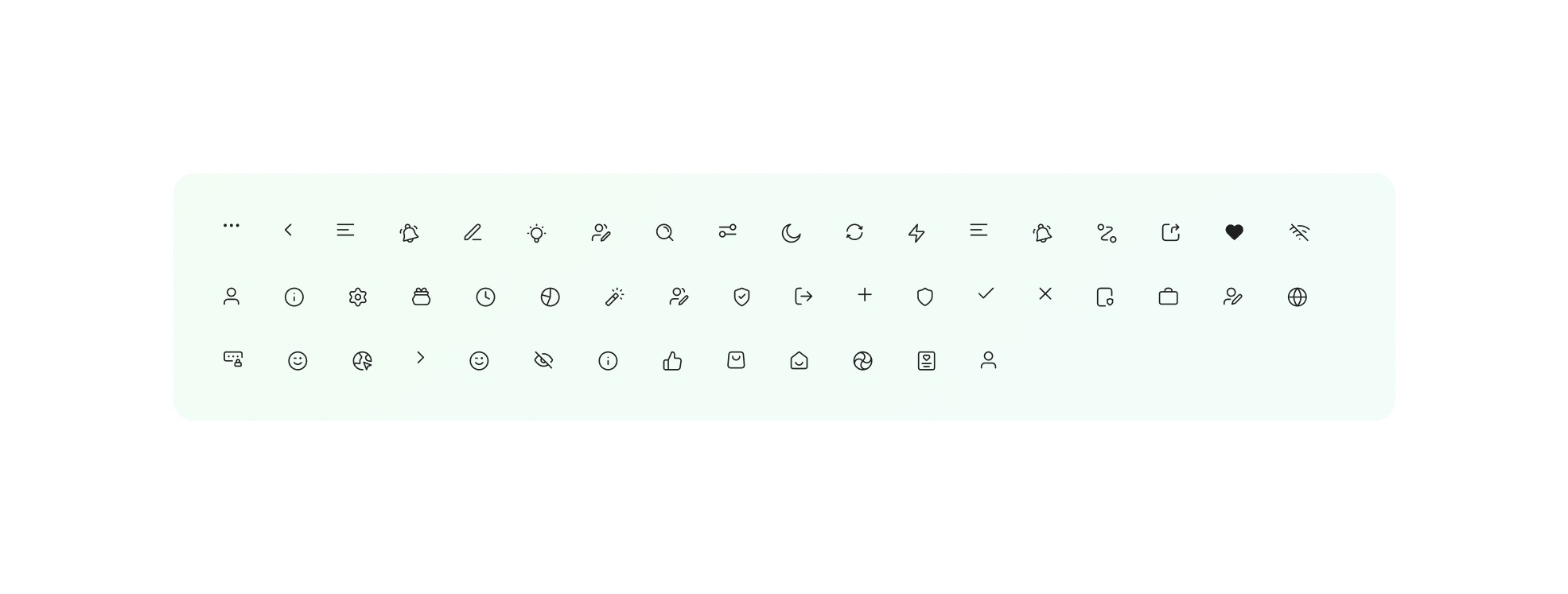
Icons
Regarding icons, I've selected those from a Figma icon library named Untitled UI Icons. These icons have been customized for easy editing and are formatted within a 48x48 bounding box to facilitate tapping.
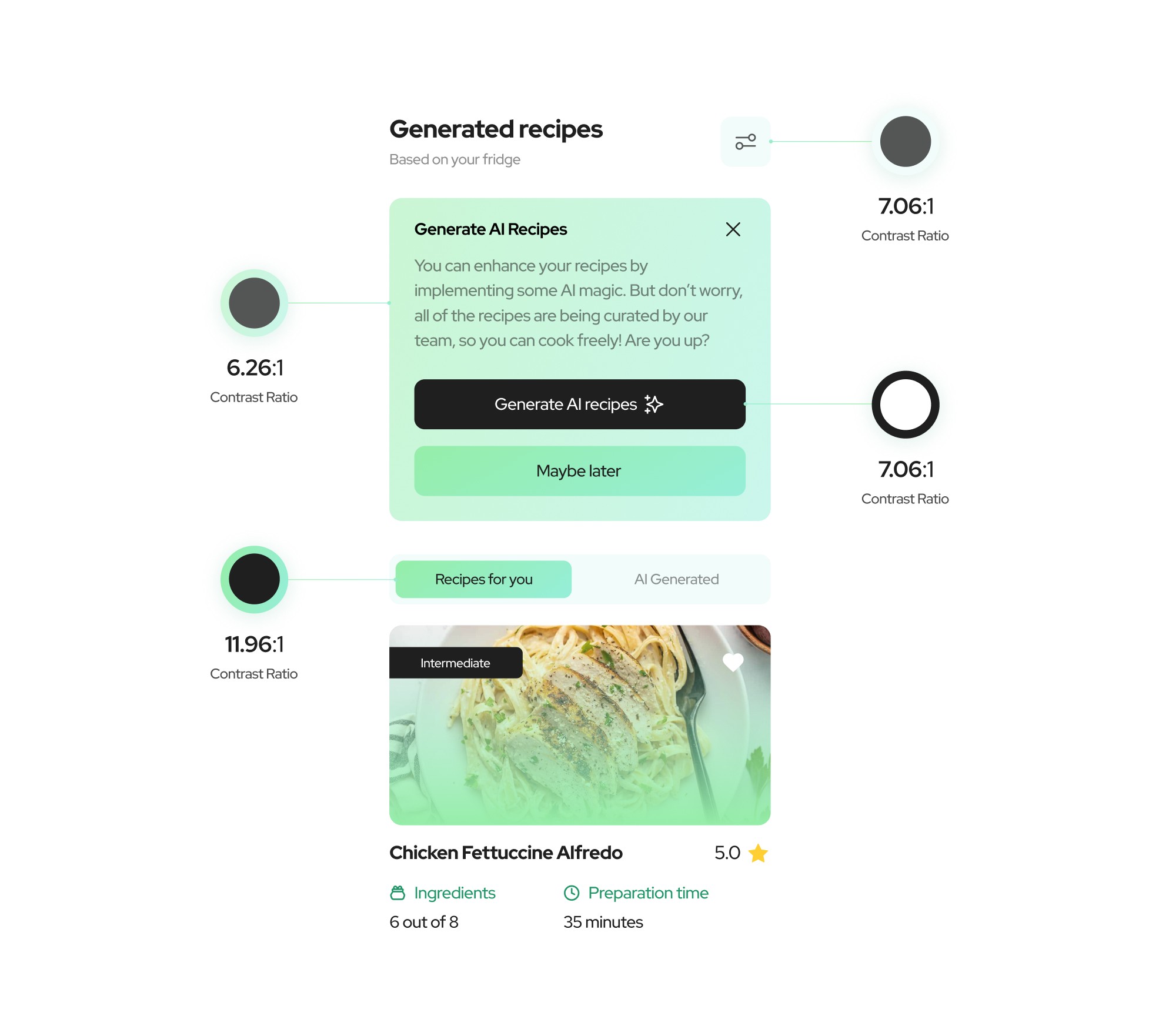
Accessibility Evaluation
I employed the 'Contrast Checker' tool provided by WebAIM to assess the contrast levels of the labels, text, and buttons within my designed application. This step was taken to ensure compliance with all WCAG standards.
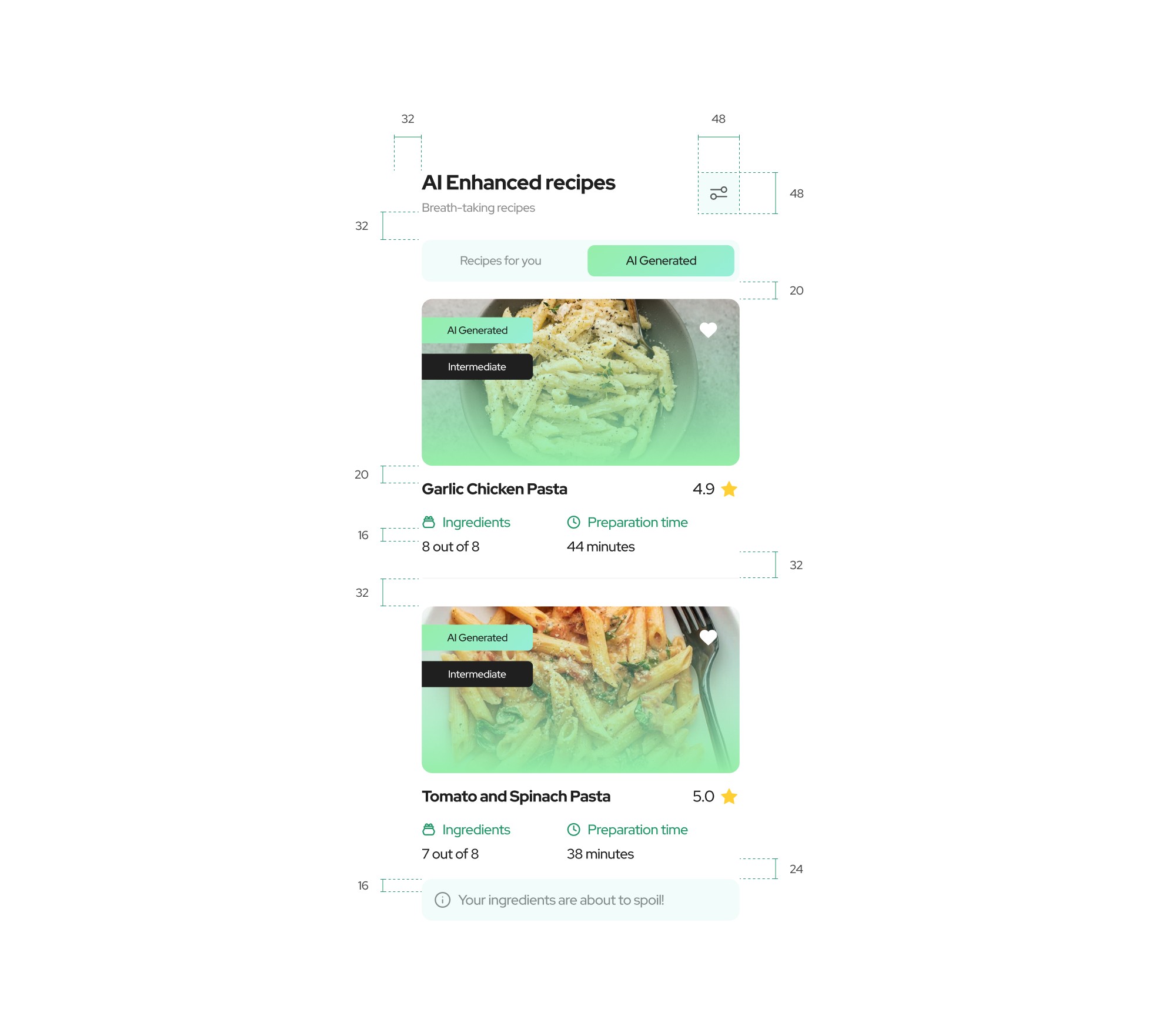
Alignment & Grid
The design relies on a fluid grid system with 32-pixel margins. To guarantee adaptability across different devices, Auto-Layout was integrated into the design.
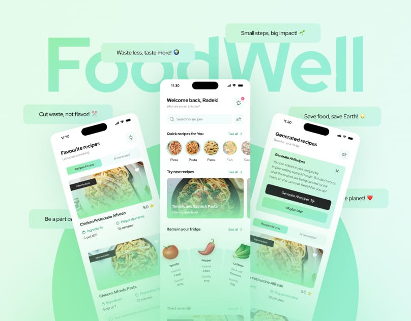
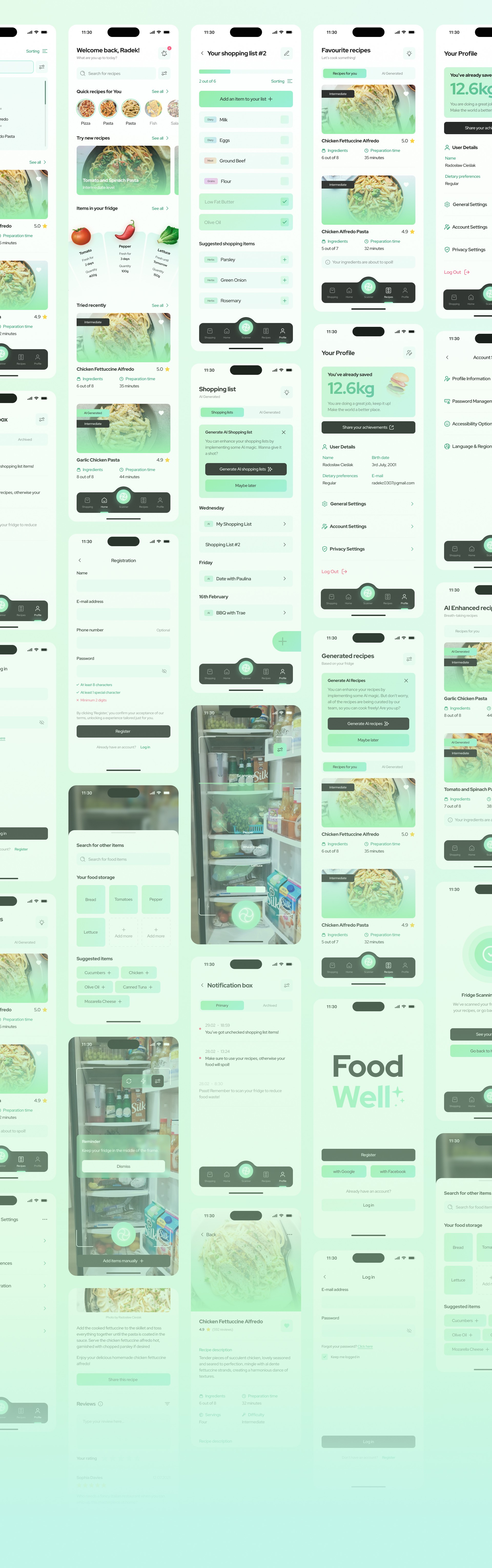
Final Design
Now we can take a glance on the app in its full glory.
Get in contact
Do you have a request or come to me with a business offer?
Write me an email and let's start working together.
radoslaw.cieslakgfx@gmail.com
Designed by Radosław Cieślak